| Image |
Comment |
| 10/22/2003 12:45:42 AM |
milkweedby ursulaComment by Simplicity: Awesome! Fantastic lighting...such wonderful, intricate detail captured....A definite 10+!! |
 Photographer found comment helpful. Photographer found comment helpful. |
| 10/21/2003 11:22:51 AM |
|
| Photographer found comment helpful. |
| 10/21/2003 11:05:25 AM |
|
| Photographer found comment helpful. |
| 10/21/2003 08:27:13 AM |
milkweedby ursulaComment by newtune3: What a great macro shot. The detail is great and the light from behind adds to that. |
| Photographer found comment helpful. |
| 10/20/2003 11:30:59 PM |
milkweedby ursulaComment by ellamay: i love the softness and background colors in this shot, the fine 'hairs', good composition. Very nice work. |
| Photographer found comment helpful. |
| 10/20/2003 07:27:16 PM |
milkweedby ursulaComment by LucidLotus: I like the lighting on the whisps, especially the way it highlights certain ones like miniature lighting bolts. However, I don't like the color of the background - I think it competes with the main subjects. With them being so delicate I think a darker background that would let them stand out more would work better, but that's just my opinion. 6 |
| Photographer found comment helpful. |
| 10/20/2003 04:41:03 AM |
milkweedby ursulaComment by hughletheren: This is very clever, the highlights on the strands are very effective abd I love the back gound soft-tones. |
| Photographer found comment helpful. |
| 10/20/2003 03:30:48 AM |
|
| Photographer found comment helpful. |
| 10/20/2003 12:39:46 AM |
milkweedby ursulaComment by dsidwell: Hey I did a milkweed shot once! I like the colors in yours! Cool idea! 10 |
| Photographer found comment helpful. |
| 10/17/2003 07:56:33 PM |
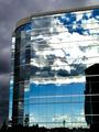
sweet dreams, my pretty-prettyby ursulaComment by e301: I once had a huge appreciation for very pure staurated colours, like the blue in this photo, Ursula; but i've kind of given myself an ongoing task to investigate duotone/b&w photography, and so my mind is perhaps more focussed on contrat and formmal content than is reasonable to jusge a photo. All of which is mentioned because I think this would have made a wonderful black and white image: a marvellous range and variety of contrast, from the immediate black vs. white of moments in the statue, to the gentle graduation of the reflected sky and the clouds.
I like the parallel of the blown-out steel in bot the window frames and the statue, and the contrat of the fluid shapes of the art and the rigid regulated structure of the window franes. I'm kind of surprised to see it score so low ... though i think I have an idea why.
The reflected building: especially ggiven tha challenge topic. If the were no reflected structure, i think it would hav score considerably higher - I think that building adds an element of everyday reality that takes away from any feeling of the unusual, the non-humdrum, that's hurt this image in terms of the challenge. Likewise if you'd included more of that building, the efffect would have been different - some kind of comment on office life, or city life, set against the evident freedom of that sculpture. With just the qurter-view of it present, I think the pic falls between two stools a little, and I think that hurt your score.
Still, an intersting image, and a pleasure to think and to write about for fifteen minutes.
Ed |
| Photographer found comment helpful. |
Home -
Challenges -
Community -
League -
Photos -
Cameras -
Lenses -
Learn -
Help -
Terms of Use -
Privacy -
Top ^
DPChallenge, and website content and design, Copyright © 2001-2026 Challenging Technologies, LLC.
All digital photo copyrights belong to the photographers and may not be used without permission.
Current Server Time: 07/21/2026 07:39:27 PM EDT.