| Image |
Comment |
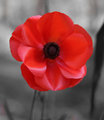
| 10/07/2007 07:56:25 AM |
In Flanders fields, the poppies blow.by Delta_6Comment by MikeO: I just love poppies ! My grandfather was at Gallipoli (sp?), in France, Palestine and the middle east during WW1, he survived. Thanks for sharing, Mike Message edited by author 2007-10-07 07:57:12. |
 Photographer found comment helpful. Photographer found comment helpful. |
| 10/07/2007 06:14:44 AM |
|
| Photographer found comment helpful. |
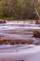
| 09/17/2007 09:09:32 AM |
noblefallswebquick.jpgby Delta_6Comment by CNovack: I love the sense of movement seen in the flow of water. Love the silkiness of the water as it flows over the rocks and down river - there is just something magical about that flow. This is a nice scenery shot but it could have more visual punch. First I think it would be better if you used a square crop for two reasons. First it would keep and focus our attention on the water flowing over the rocks thereby making that the main focal point of the shot as a whole. Second it would crop out the bottom third to just at those rocks at the bottom of the river - that movement of water and portion of the composition does nothing for the image as a whole. Matter of fact it detracts from the main focus - the lovely fall of the water over the rocks further upstream. Next, I think this photo can do with a tad bit more color saturation - not too much for you don't want it to go over into the oversaturation category. Bumping up the color saturation and a bit more contrast will make this photo have more richer tones that would increase the visual appeal. |
| Photographer found comment helpful. |
| 09/15/2007 10:21:00 AM |
When the winds of life blow, bend if you must but dont you breakby Delta_6Comment by violinist123: Critique Club feedback -
This shot had all the elements of a high scoring motivational poster, but a few things held it back.
The image itself is great and well composed. It almost screams 'slap some text on me and let's make a poster!'. It really needs increased contrast to get the tree to pop out of the rest of the scene. Also shooting this from a lower point of view so that the tree itself would be framed entirely by sky rather than by the horizon split would also give it more weight.
The phrase you chose works very well with the imagery. The layout of the text and the font used are also nice.
I think people had a fairly concrete notion of what these posters should look like as far as font and overall graphical design, and this poster is very different from that standard. That is probably the largest reason this didn't score higher.
Nonetheless, a very creative and well designed poster. If you choose to follow the herd-think next time this challenge pops, you will no doubt be a top contender.
|
| Photographer found comment helpful. |
| 09/13/2007 02:27:06 PM |
|
| Photographer found comment helpful. |
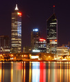
| 09/12/2007 12:26:39 PM |
Perth by nightby Delta_6Comment by DrAchoo: ya, I like this one much better. The lighting is wonderful. I still want some breathing room, I think. You managed both horizontal and vertical levels this time. ;) |
| Photographer found comment helpful. |
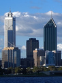
| 09/11/2007 06:59:31 PM |
Perth - Late afternoon.by Delta_6Comment by DrAchoo: Technicals: The lighting is nice. The focus appears to be on. You will notice that you had to choose between a level horizon and vertical buildings. You went buildings, which is probably the right answer. Sometimes perspective correction can let you do both.
The feel: The clouds add appeal in the background. I think the shot feels cramped. I don't know what is to the left and right there in Perth, but I think I want to let those buildings breathe.
The game: Not bad. If anything, I would have tried to spot a time with even more dramatic light. It's certainly not bad here, but I'm sure you could squeeze a little more "wow" out of this shot. |
| Photographer found comment helpful. |
| 09/09/2007 02:19:28 AM |
|
| Photographer found comment helpful. |
| 09/08/2007 02:11:57 PM |
|
| Photographer found comment helpful. |
| 09/06/2007 09:32:05 PM |
|
| Photographer found comment helpful. |
Home -
Challenges -
Community -
League -
Photos -
Cameras -
Lenses -
Learn -
Help -
Terms of Use -
Privacy -
Top ^
DPChallenge, and website content and design, Copyright © 2001-2026 Challenging Technologies, LLC.
All digital photo copyrights belong to the photographers and may not be used without permission.
Current Server Time: 06/11/2026 03:04:20 PM EDT.