| Image |
Comment |
| 06/30/2008 05:29:33 PM |
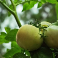
Homegrown: Reducing Dependenceby 777STANComment by bassbone: lovely sentiment here- and I can appreciate what the image is trying to say - i just worry about the connection to the challenge without the title
in addition, the softness of the image does not seem to work for me |
 Photographer found comment helpful. Photographer found comment helpful. |
| 06/30/2008 02:48:44 PM |
|
| Photographer found comment helpful. |
| 06/30/2008 07:58:02 AM |
|
| Photographer found comment helpful. |
| 06/30/2008 12:52:52 AM |
|
| Photographer found comment helpful. |
| 06/29/2008 09:05:37 PM |
"Let's Be Clear on Who's Important!"by 777STANComment by ambaker: Critique Club Review:
Color Saturation and Hue: Overall the colors are well done, but the skin tones of the girl appear to be a bit off. A little pale here, almost bluish. The skin tones of the adult look a little more red than they should. (At least on my monitor.) Brightness and contrast, are overall well done. However, the girl's forearm loses detail and is washed out.
Focus and depth of field are very good. Nice job of using depth of field to isolate the subject from the background.
Challenge purists may grade you down a bit because the image looks more like a snapshot than a pose.
The crop may be a little tight on this image, as the girl's disembodied hand comes up out of nowhere to the woman's face.
Overall a very pleasing image. I'm sure that both subjects will treasure it in years to come. |
| Photographer found comment helpful. |
| 06/28/2008 07:37:24 PM |
|
| Photographer found comment helpful. |
| 06/27/2008 11:55:20 PM |
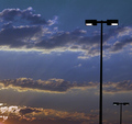
Light Poleby 777STANComment by bob350: The second light pole helps contribute balance to the image as an artwork, but I would have added an extra point if you had stepped a bit to the right to eliminate it and leave a single upright line to more closely meet the challenge. Nice exposure to capture such a wide range from light to dark. |
| Photographer found comment helpful. |
| 06/25/2008 03:01:58 PM |
Highway Robberyby 777STANComment by karmat: CRITIQUE CLUB CRITIQUE
by karmat
Compositionally, it is good that the sign with the prices "anchors" the shot on the right. I assume that is your focal point. The eaves of the "shelter" over the pumps also serve as a kind of leading line pointing you to the sign. The price sign is straight, but the perspective of the the rest of the shot leads it feeling a bit tilted to the right. I'm wondering if a different angle would take advantage of the "patterns" created by the tanks, and minimize the actual price. That way, you would still get your idea across, but in a more generic way (those with higher prices wouldn't be distracted by your lower ones, etc). Or you could have tried to simplify the shot and not include quite so many elements of the station.
Technically, I like the high contrast and the fact that you resisted the urge to super-saturate the greens, as some are in the manner of doing. The deeper hues gives it a more serious, heavy feeling. The focus seems pretty good, and clear, especially on the sign and falling off some on the rest of the shot. On the one hand, this further directs attention to the sign, but on the other, it can give the impression that focus isn't as clear as it could be. Also, the lighting is extremely harsh on this. I think it would work, generally, to further the mood of your shot, but that shadow down the middle of the sign on the right is really distracting.
Overall, a decent shot that meets the challenge in a political statement kind of way.
Karma |
| Photographer found comment helpful. |
| 06/24/2008 11:53:44 PM |
|
| Photographer found comment helpful. |
| 06/24/2008 11:42:47 PM |
|
| Photographer found comment helpful. |
Home -
Challenges -
Community -
League -
Photos -
Cameras -
Lenses -
Learn -
Help -
Terms of Use -
Privacy -
Top ^
DPChallenge, and website content and design, Copyright © 2001-2026 Challenging Technologies, LLC.
All digital photo copyrights belong to the photographers and may not be used without permission.
Current Server Time: 07/22/2026 06:36:17 PM EDT.