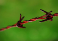
DPChallenge: A Digital Photography Contest You are not logged in. (log in or register
 
Browse Settings
Currently viewing:
Registered UserZigomar

Show comments:

Per page:

Order:

Comments:


Comments Received by Zigomar
Pages:   ... [261] [262] [263] [264] [265] [266] [267] ... [281]
Showing 2631 - 2640 of ~2809
Image Comment
Temple of Saint Sava
05/10/2006 02:35:48 PM
Temple of Saint Sava
by Zigomar

Comment by Dudski:
Wow. Gorgeous looking place. It's too bad some detail got lost in the cross.
Photographer found comment helpful.
Temple of Saint Sava
05/10/2006 02:12:02 PM
Temple of Saint Sava
by Zigomar

Comment by Jaded_Housewife:
wonderful colors, the poop on the statue is a little nasty. i would have cropped that out myself. but nice photo
Photographer found comment helpful.
Temple of Saint Sava
05/10/2006 12:35:26 PM
Temple of Saint Sava
by Zigomar

Comment by TrynityRose:
The white borders on being overexposed, the grass seems to be overly saturated, the cross is in an interesting place between his legs (hehe), and I like the inclusion of the bird since he was likely the one that left the evidence on top of the guy. It's a little over the top processed but I like it!
Photographer found comment helpful.
F#
05/09/2006 01:26:29 PM
F#
by Zigomar

Comment by JUSTCALLMELADY:
wonderful interpretaion of the theme! I wish your DOF was a little bit wider, but the one key certainly makes a statement. very nice!
Photographer found comment helpful.
F#
05/09/2006 07:57:38 AM
F#
by Zigomar

Comment by MrXpress:
This is a better-done version of my challenge picture. Good work!
Photographer found comment helpful.
F#
05/08/2006 06:55:49 PM
F#
by Zigomar

Comment by Lilhoop:
very blurry too. next try and zoom out a lil more
Photographer found comment helpful.
F#
05/08/2006 12:47:42 PM
F#
by Zigomar

Comment by Marjo:
Nice composition. I'm seeing some zaggies. Perhaps oversharpened?
Photographer found comment helpful.
F#
05/07/2006 10:19:59 PM
F#
by Zigomar

Comment by azaboi:
very nice. I wonder if a lower angle would have helped. Either way, I like it.
Photographer found comment helpful.
Tetanus
05/07/2006 06:08:59 PM
Tetanus
by Zigomar

Comment by CEJ:
hello from the Critique Club!

I have studied your image and have the following to offer:

Composition/perspective:
Composition is very well done. The ends of the barbed wire cut almost exactly at thirds lines which places the subject at a very appealing angle to the eye. The placement of the barbs is also very well done. The angle of approach to the shot seems well placed. The background is solid to the theme keeping distracting elements out of the shot. Well done. Appears a bit grainy in the green, but not distracting or taking away from the image. The DoF is interesting though. It appears your main subject is the spider on the wire. It may have been stronger if both the barbs were within the DoF (obviously including the spider) which would have set up a sort of 'trapped' element to the shot. Overall composition is very well done.

Color:
The colors are very strong and consistent in the shot. The variations seem natural and not forced by processing. Both the main colors are very strong and well preserved throughout the image.

Lighting:
This seems to be a weaker area to me. The setting seems totally natural but the lighting doesn't. The bright spots on the wire take that element away. Some appear to be due to oversharpening, others appear to be either direct light or flash that when coupled with the DoF of the shot seem out of place. A softer light on the wire may have helped.

Challenge:
Definitely met the challenge criteria. The color scheme is simple yet effective. Two strong colors that complement each other well. I like that you chose rust as opposed to a more general red color. The tonal contrasts are stronger and less harsh to view. Well done!

Overall/my opinion:
The DoF being a strong point for this composition is also a weak point. I really feel it would have been stronger with both barbs in focus. The composition is very appealing and the balance is well placed. The spider adds an element of 'surprise' to the shot that could have been better served if it was not the only focused point (that and a little of the wire in front of it). Also, if you meant to focus on the spider and not the barbs and just use the wire for the color, a different angle to bring the spider into a more prominent position in the shot would have helped. Overall a well done composition with a lot of appealing qulities.
Photographer found comment helpful.
F#
05/07/2006 12:14:26 AM
F#
by Zigomar

Comment by scruff:
Cool title - why not G flat? Very limited dof in this shot, not sure if it helps or not.
Photographer found comment helpful.
Pages:   ... [261] [262] [263] [264] [265] [266] [267] ... [281]
Showing 2631 - 2640 of ~2809


Home - Challenges - Community - League - Photos - Cameras - Lenses - Learn - Help - Terms of Use - Privacy - Top ^
DPChallenge, and website content and design, Copyright © 2001-2025 Challenging Technologies, LLC.
All digital photo copyrights belong to the photographers and may not be used without permission.
Current Server Time: 09/03/2025 05:54:23 AM EDT.