| Image |
Comment |
| 04/21/2006 11:28:14 PM |
|
 Photographer found comment helpful. Photographer found comment helpful. |
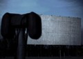
| 04/21/2006 08:37:50 PM |
Serving You Since 1933by GivemeashotComment by Rebecca: It took me awhile to figure out what this was.. the big black speaker looming in the foreground is very distracting because it is badly out of focus and yet takes up so much of the frame. I feel like I'm missing half the photo. |
| Photographer found comment helpful. |
| 04/21/2006 07:57:47 PM |
|
| Photographer found comment helpful. |
| 04/21/2006 11:25:03 AM |
J.E. Band 4by GivemeashotComment by SJCarter: Again, I like the location and poses. The OOF is a distraction though and the lighting just doesn't seem to want to cooperate with you. It's too bright or too dark! (I HATE THAT!) ;-) You might consider cropping more off the bottom of this one - the foreground street serves no real purpose (as it's evident where they are) and it would move the viewer closer to the subjects. And I would make sure with my crop that I'm not cutting off any lettering - it doesn't look clean. Either clone out the portions you don't want or crop them off. Just my $0.02... Message edited by author 2006-04-21 11:26:10. |
| Photographer found comment helpful. |
| 04/21/2006 11:22:24 AM |
J.E. Band 12by GivemeashotComment by SJCarter: I didn't care for this one at first, but it's grown on me. I really like the processing and the crop works. It's still a little too dark, but I think you're on the right track here. |
| Photographer found comment helpful. |
| 04/21/2006 11:21:18 AM |
J.E. Band 2by GivemeashotComment by SJCarter: I like the backdrop and blue sky, but it seems awfully centered. The "up" angle is also good. Sun is too bright - see harsh shadow on left guy's face and glare on white shirt? Plus, they're all squinting. This would be a great location to reshoot though... At a different time of day and with the cross off to one side. |
| Photographer found comment helpful. |
| 04/21/2006 11:18:42 AM |
J.E. Band 1by GivemeashotComment by SJCarter: I think this one is pretty good. I'd actually zoom in a bit closer though and lose more of the left. :-) The guy in the back with his head turned is a little distracting, but maybe he is too - lol! |
| Photographer found comment helpful. |
| 04/21/2006 11:17:01 AM |
J.E. Band 5by GivemeashotComment by SJCarter: Watch your titled horizon. The guys almost look like they're in a line-up (which might be a good idea for another pose?). Again, bright sunshine washed everything out and your focus could be a bit sharper. I do like the tones you're using though. |
| Photographer found comment helpful. |
| 04/21/2006 11:14:37 AM |
J.E. Band 6by GivemeashotComment by SJCarter: Great location to shoot. Don't care for the pose of the guy in front and your focus seems off. You'll want to watch your horizontal and vertical lines too - it's easy to get a tilted feel in these types of situations. Again, bright sunlight is casting harsh shadows. I'd shoot later in the day or early morning - maybe even early evening? |
| Photographer found comment helpful. |
| 04/21/2006 11:10:54 AM |
J.E. Band 3by GivemeashotComment by SJCarter: This is a really cool idea. I like the concept a lot. A couple of things though - you've really gotta watch the shadows (notice how the guy in back is partially blocked?). Also I think it's too far away - you can't really distinguish their features very well. I'd get in a little closer. The long shadows from them and the heavy contrast are cool. I'd make sure that there are no "other" shadows though - like along the bottom and the object in the bottom right. Message edited by author 2006-04-21 11:11:58. |
| Photographer found comment helpful. |
Home -
Challenges -
Community -
League -
Photos -
Cameras -
Lenses -
Learn -
Help -
Terms of Use -
Privacy -
Top ^
DPChallenge, and website content and design, Copyright © 2001-2026 Challenging Technologies, LLC.
All digital photo copyrights belong to the photographers and may not be used without permission.
Current Server Time: 07/16/2026 08:57:57 AM EDT.