Silhouetteby
cnobreComment by karmat: CRITIQUE CLUB CRITIQUE
by karmat
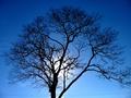
COMPOSITION
I think you have done an effective job of filling the frame nicely with the tree. Also, the placement of the sun is good because it allows the eyes to see both the tree and bright spot at one time. I agree with some of the others that this may not have been the best choice for a "landscape" shot, as it doesn't show any land, and only one tree, but I tried to keep a fairly broad interpretation in mind.
TECHNIQUE
You have done a very good job of getting the detail of the tree to show. I think many times on a digi cam, trees end up being very soft and fuzzy around the edges (yours is a little, but not bad). The blue sky is awesome -- were you using a polarizer? The complete silhouette of the tree is nice as well because it makes the shot very simple and pleasing to look at. As others have mentioned, I think cropping some at the bottom would eliminate the power line, and that would be good because the lines look so out of place. Also, since the tree "spills" out of the frame on the right, a closer crop on the left might be good too. Finally, there is some noise/grain in the sky. I have found that the free download of "neatimage" works wonders on this. It may, however, soften parts of your tree.
OVERALL EFFECT
The simplicity of this shot is perhaps its strongest feature. The simple composition and contrasting colors are pleasant to look at. Not including more of the surrounding countryside may have hurt the score some because some people specifically wanted land in the landscape.
Nice work and I look forward to seeing more of yours.