| Image |
Comment |
| 05/10/2006 05:11:44 AM |
|
 Photographer found comment helpful. Photographer found comment helpful. |
| 05/10/2006 03:10:12 AM |
|
| Photographer found comment helpful. |
| 05/10/2006 03:08:43 AM |
|
| 05/10/2006 02:28:45 AM |
Geometryby manic35Comment by jdannels: A Critique Club Visit(sort of)
I believe this may be an unofficial visit since your pic was in my cue and I was trying to gather thoughts on it when the change over came and the photo disappeared but I wanted to critique it anyway.
At first look it does have that "pop" that so many voters love on this myself included. You managed to create a negative image that was very easy to look and kept many details that appeared to not be so negative such as the the silver? plate and the blues come across very natural smooth. The composition is very good as well as how even the light is across the two stars.
A few nit picky things about the photo is that there seems to be some dust on the middle star which was probably reflections and bright reflections but comes across as sensor dust. I think your border works to a certain degree but it appears the thin blue line is thinner on the top and on the rightthen it is on the bottom and left. I also think that the outer black is too thick and even though it was only mentioned once by a commenter I think many voters see a border around this size and may take a point away here and there.
I wonder if you tried positioning the star differently with the point a point pointed directly at the viewer if that would and either wider angle with the front exagerated and close to the viewrw if that would have raised the score abit.
Really this was an excellent entry and it is hard to find too many improvements on what you shot and I think you did an excellent job for the challenge.
Hope this helps and if you have any more questions you can send me a PM. |
| Photographer found comment helpful. |
| 05/10/2006 02:14:04 AM |
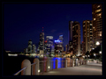
R I V E R W A L Kby manic35Comment by GIS_boy: Great aspect and composition, I really like the riverwalk path trailing off into the distance, very nice perspective feel. This would make a great blow-up for the wall. |
| Photographer found comment helpful. |
| 05/09/2006 09:09:39 AM |
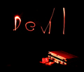
Devil's Playing Cardsby manic35Comment by Elvis_L: I like the idea. the poker stuff in the corner really works for me. the light could have been better but I understand how tough it can be. focus seems soft on the poker stuff but over all good idea. |
| Photographer found comment helpful. |
| 05/09/2006 08:06:36 AM |
|
| Photographer found comment helpful. |
| 05/09/2006 06:09:09 AM |
|
| Photographer found comment helpful. |
| 05/09/2006 04:47:50 AM |
|
| Photographer found comment helpful. |
| 05/09/2006 01:33:55 AM |
|
| Photographer found comment helpful. |
Home -
Challenges -
Community -
League -
Photos -
Cameras -
Lenses -
Learn -
Help -
Terms of Use -
Privacy -
Top ^
DPChallenge, and website content and design, Copyright © 2001-2026 Challenging Technologies, LLC.
All digital photo copyrights belong to the photographers and may not be used without permission.
Current Server Time: 06/02/2026 02:03:42 PM EDT.