| Author | Thread |
|
|
05/17/2006 09:21:20 PM |
Greetings from the Critique Club...
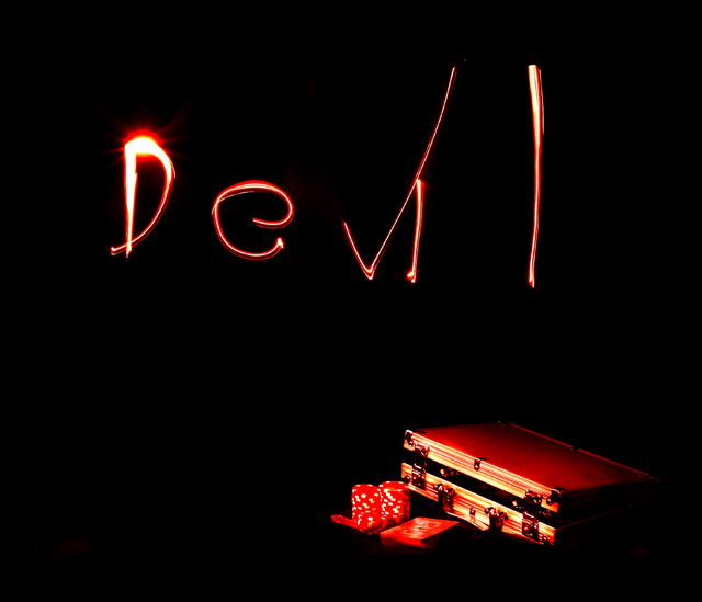
I like the idea and the execution came out very well. The lighting is well done and the composition works. I also like the red contrasted against the black, which is very devilish in nature. So really there's nothing technically wrong here.
My only suggestion would be to have a stronger subject to depict the devil. I think the text could work but there needs to be more. Perhaps have something in the background that fills space. For example, a dimmed image of fire as a backdrop with the letters painted over it? I found this graphic online of a burst of flame. When I blend this over your photo (Screen mode) it roughly illustrates what I am envisioning here. Anyway, just a thought.
Edited to fix link. The link will take you to a google search. That first image of a burst of flame is what I am talking about. Unfortunately it won't let me link to it directly.
Message edited by author 2006-05-17 21:27:08. |
|
 Photographer found comment helpful. Photographer found comment helpful. |
Comments Made During the Challenge  |
|
|
05/14/2006 07:51:26 PM |
|
wonderful use of "paint with light" and the lighting on the case - black with red, title, all work so well together -- one of my ribbon picks |
|
| Photographer found comment helpful. |
|
|
05/11/2006 10:12:43 PM |
|
This is well thought out, and also I like it..... |
|
| Photographer found comment helpful. |
|
|
05/10/2006 01:19:53 PM |
|
Spelling out the word "Devil" isn't very interesting. Nice use of darkness, though. |
|
| Photographer found comment helpful. |
|
|
05/09/2006 09:09:39 AM |
|
I like the idea. the poker stuff in the corner really works for me. the light could have been better but I understand how tough it can be. focus seems soft on the poker stuff but over all good idea. |
|
| Photographer found comment helpful. |
|
|
05/09/2006 06:09:09 AM |
|
Nice painting with light! |
|
| Photographer found comment helpful. |
|
|
05/09/2006 04:47:50 AM |
|
excellent execution ... i like the simplicity |
|
| Photographer found comment helpful. |
|
|
05/09/2006 01:33:55 AM |
|
| Photographer found comment helpful. |
|
|
05/08/2006 04:59:22 PM |
|
well shot, like the lighting. |
|
| Photographer found comment helpful. |
|
|
05/08/2006 04:56:29 PM |
|
Good title, nice picture. I wish the cards, case, etc. were just a tad brighter, but I like it. |
|
| Photographer found comment helpful. |
|
|
05/08/2006 12:36:46 PM |
|
I think this would work better without the lettering. Not that it is too bad, but I feel it doesn't add anything to the image. Also, I think the subject should be a little more in evidence (closer). |
|
| Photographer found comment helpful. |
|
|
05/08/2006 07:53:32 AM |
|
Awesome shot; great dramatic interlude of blackness; The only thing is, the devil needs to write in a scary confident way; not like a 6 year old who just learned cursive writing. |
|
| Photographer found comment helpful. |
|
|
05/08/2006 04:34:47 AM |
|
| Photographer found comment helpful. |
Home -
Challenges -
Community -
League -
Photos -
Cameras -
Lenses -
Learn -
Help -
Terms of Use -
Privacy -
Top ^
DPChallenge, and website content and design, Copyright © 2001-2026 Challenging Technologies, LLC.
All digital photo copyrights belong to the photographers and may not be used without permission.
Current Server Time: 06/28/2026 11:16:24 AM EDT.