DPChallenge: A Digital Photography Contest You are not logged in. (log in or register
 
Browse Settings
Currently viewing:
Registered Userlivitup

Show comments:

Per page:

Order:

Comments:


Comments Received by livitup
Pages:   ...
Showing 201 - 210 of ~245
Image Comment
We Honor Those...
10/13/2005 08:44:48 PM
We Honor Those...
by livitup

Comment by meow:
Good job. Really makes you think.
Photographer found comment helpful.
We Honor Those...
10/13/2005 08:25:14 PM
We Honor Those...
by livitup

Comment by philup:
great job! 10
Photographer found comment helpful.
We Honor Those...
10/13/2005 06:32:13 PM
We Honor Those...
by livitup

Comment by Jammur:
Great photo, very effective, especially adjusting to almost monochromatic.
Perspective, depth of field, composition, you got everything under control.
Superb!
Photographer found comment helpful.
We Honor Those...
10/13/2005 07:53:42 AM
We Honor Those...
by livitup

Comment by fstop28:
Love the use of depth.
Photographer found comment helpful.
Top Shelf
10/12/2005 11:10:40 PM
Top Shelf
by livitup

Comment by livitup:
Thanks for the comments everyone!

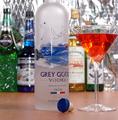
FIrst of all, my wife and I nearly came to blows over the background, and for the sake of marital bliss, I gave in. I was originally planning a shiny black background, or maybe some wood paneling, but she liked the metallic (it's actually the insulation that hangs on our basement walls!). It seems that you either love it, or hate it, and it's about 50/50 each way. Not suprising.

About the composition... I definatley should have put another bottle on the right side. I think the shot was made at a slight angle, which only made that space look bigger than it really was. The crop was done the way it is because of the space between the Grey Goose bottle in the foreground, and the rest of the bottles in the background was really about 4 feet, in order to get the depth of field right. If I had left any more of the top of the Grey Goose bottle in there would have been a huge field of the reflective background behind it, as the background bottles appeared much shorter, because of the distance. In hindsight, I could have put them on a riser to elevate them. Likewise, cropping off the glass, because of the angle, to avoid gigantic empty metallic space. Besides, I kinda think it works, but I appreciate the opinion of those who disagree.

Finally, anyone who drinks martinis, knows that the lemon twist goes IN the glass, not ON the glass. :)

Thanks again!

Message edited by author 2005-10-12 23:11:15.
We Honor Those...
10/12/2005 11:07:56 PM
We Honor Those...
by livitup

Comment by Shan2112:
of all the images that include a flag of some sort - this one is my favorite, good work :)
Photographer found comment helpful.
Fresh
10/12/2005 11:02:19 PM
Fresh
by livitup

Comment by livitup:
Thanks to all who gave comments. The "red" vase is actually purple, I was going for two sets of complementary colors. However it didn't show up purple enough on some people's monitors, I guess. Someone pointed out that the entire background has a purple cast, which I didn't notice before. "Automatic" white balance failed me again.

I'm unhappy that there is a clear line between the two sheets of paper that I used for background and to cover the table. There's also a light tilt downhill, from right to left, caused by a tripod with a crappy vertical adjustment lock. Oh well. I'm happy with the score and place. Thanks again.
We Honor Those...
10/12/2005 04:10:52 PM
We Honor Those...
by livitup

Comment by Rikki:
This is a great and powerful image. The headstones are too close to the left hand side. I think if this were a true selective desat it would be more powerful. Boost your levels to darken things a bit. It seems a bit washed out. 7
Photographer found comment helpful.
We Honor Those...
10/12/2005 01:15:00 AM
We Honor Those...
by livitup

Comment by zara-opal:
too many blurred objects
Photographer found comment helpful.
Fresh
10/10/2005 08:40:43 AM
Fresh
by livitup

Comment by HVGB_photos:
This would have been a more successful demonstration of the effect of complementary colours if you had removed the vase with the yellow flowers and just gone with the red/green complementary contrast.
Pages:   ...
Showing 201 - 210 of ~245


Home - Challenges - Community - League - Photos - Cameras - Lenses - Learn - Help - Terms of Use - Privacy - Top ^
DPChallenge, and website content and design, Copyright © 2001-2025 Challenging Technologies, LLC.
All digital photo copyrights belong to the photographers and may not be used without permission.
Current Server Time: 08/01/2025 06:20:29 AM EDT.