| Image |
Comment |
| 01/30/2006 09:05:18 AM |
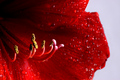
Amaryllisby livitupComment by Jutilda: What makes this for me is the vivid red, my favorite color, with the hint of pink and gold. Great shallow DOF. |
 Photographer found comment helpful. Photographer found comment helpful. |
| 01/30/2006 06:44:52 AM |
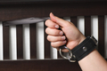
Restrainedby livitupComment by mycelium: man, this really should have scored higher. I gave it an 8 and I think it deserved it. |
| Photographer found comment helpful. |
| 01/29/2006 10:21:58 PM |
|
| Photographer found comment helpful. |
| 01/28/2006 11:43:23 PM |
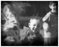
Play Timeby livitupComment by loseme: *Critique Club*
Play Time is a good example of the single out category. After looking at the photo and reading your photographer's comments, it makes much more sense as to why. I like the 4x3 approach, I don't know if I would have noticed without reading your comments, so I am very thankful you posted that. I also think people probably would have voted higher also if they understood what you were trying to do, like if we could see the comments during voting. I really do like the layer and contrast you used to give more depth the shot and single out the subject. The grain is probably a little distracting for some voters, they may even have thought it was a photographic error as opposed to the impression you were trying to achieve. Also I think black and white was a great choice, colors might have taken away from the subject too much.
I think this is one of those piece that you should be very proud of you defiantly captured the subject in a prefect manner. |
| Photographer found comment helpful. |
| 01/27/2006 12:33:17 PM |
Restrainedby livitupComment by YourBuddyFlo: The pictue at first seems to be black and white but then i noticed that it was a colour print, nice job with that part. |
| Photographer found comment helpful. |
| 01/27/2006 12:23:50 PM |
|
| Photographer found comment helpful. |
| 01/25/2006 11:35:50 PM |
Restrainedby livitupComment by metoecus: This looks a little too staged and self-conscious to work. The bright lighting contrasts with the somewhat dark thematic elements, and the composition doesn't use that contrast to it's advantage. The well-manicured nails and the fact that the model's hand is holding the restraint rather than being held by it seems to work against the intended theme as well. This ironic contrast between the various thematic elements could be made to work in your favor, but somehow it seems too accidental to work here. |
| Photographer found comment helpful. |
| 01/24/2006 07:13:05 AM |
|
| Photographer found comment helpful. |
| 01/23/2006 07:25:00 PM |
|
| Photographer found comment helpful. |
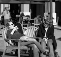
| 01/23/2006 07:23:58 PM |
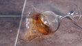
candid1-dpc.jpgby livitupComment by SJCarter: Great tonal range for B/W. Really good focus too. Looks like there's certainly a story going on... Nice candid. |
| Photographer found comment helpful. |
Home -
Challenges -
Community -
League -
Photos -
Cameras -
Lenses -
Learn -
Help -
Terms of Use -
Privacy -
Top ^
DPChallenge, and website content and design, Copyright © 2001-2026 Challenging Technologies, LLC.
All digital photo copyrights belong to the photographers and may not be used without permission.
Current Server Time: 07/16/2026 02:25:40 PM EDT.