Wine and Cheeseby
orussellComment by HBunch: *Critique Club*
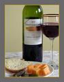
Here is what I think. I think that the crop is actually ok in my opinion. I dont mind at all that you have cropped off the neck of the bottle, nor the side of the cup. I have seen a lot of ads this way. It puts the focus on the brand of the bottle, rather than the 'prettiness' of the bottle.
I think that the tablecloth should be straightened up. there is a wrinkle in the back that kind of takes away from the smootheness of the bottle and glass.
The focus is a little soft, especially on the food items. I like the food items, and think they are an excellent addition for the challenge. Green pickles, and orange cheese. I do think though that the bread, like the tablecloth, takes away some of the smootheness because of the rough texture. The smoothe things, kind of clash with the rough things. Maybe throw in a smoothly cut piece of bread, or maybe some crackers instead.
The lighting works really well for me here. I like how there are a couple little reflections,that are not so big and bright that they are distracting.
I do not like the grey/cheese border though. lol. It's a little much for me. Not quite sure what color border would work. Probably just a thin plain black one.
Overall, it's a nice set up, with a few minor adjustments, I could see this on the front of a party invitation.
As for the color of the wine? I know my cool-aids better than my wines, so if you hadn't mentioned it, I'd never know. lol.
~Heather~