| Image |
Comment |
| 11/01/2013 10:13:57 PM |
|
 Photographer found comment helpful. Photographer found comment helpful. |
| 11/01/2013 09:45:34 PM |
|
| Photographer found comment helpful. |
| 11/01/2013 10:12:08 AM |
|
| Photographer found comment helpful. |
| 10/22/2013 11:33:10 PM |
|
| Photographer found comment helpful. |
| 10/22/2013 08:39:19 PM |
|
| Photographer found comment helpful. |
| 10/22/2013 06:16:25 PM |
|
| Photographer found comment helpful. |
| 10/22/2013 06:01:13 PM |
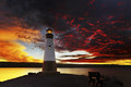
To the Lighthouse: Virginia Woolfby vikasComment by bvy: (Know that I only vote in even numbers.)
A four for you. This has some potential, but here's what's bugging me: The sky is colorful but too blown out. Also, I'm a big fan of center framing, but I don't feel like it works here. I think I'd rather see it landscape oriented and off to one side.
So now you know! |
| Photographer found comment helpful. |
| 10/22/2013 04:45:10 PM |
To the Lighthouse: Virginia Woolfby vikasComment by tvsometime: Visual impact here is mixed: nicely framed and centered subject and atmospheric with a cottony sea from the long exposure. However, on my monitor, the colors appear oversaturated and the contrast a little excessive with halos along the contrasty edges caused by a bit too strong sharpening. The centered composition is useful to pull attention to the lighthouse itself, which would or should be the main subject. As to topicality, like so many others in the challenge, this is a very literal take on the title of the book. I haven't read the book but from the synopsis is appears the trip to the lighthouse only takes place only in the last section of the book and may include a sunset, if only in the minds of the characters. Overall, I feel this rates a 5. Could be a 6 with gentler processing. |
| Photographer found comment helpful. |
| 10/22/2013 12:45:19 PM |
To the Lighthouse: Virginia Woolfby vikasComment by emoons: I like the colors in this. The whites in the sky are a little too bright for me. Your intention may have been to have the lighthouse centered, but I think shifted a little to the right would have been nice.
I would also like to see a little more detail in the lighthouse. Maybe a fill light or a Brightness/Contrast mask to bring it out a little more.
Gave it a 5 |
| Photographer found comment helpful. |
| 10/21/2013 10:35:45 PM |
To the Lighthouse: Virginia Woolfby vikasComment by dtremain: Comment Challenge: Love the fire in the sky. Great lighthouse. Perhaps a less centered composition would be an improvement (but how do you give up the fire in the clouds on either side?). Also, the lighthouse appears to be a bit underlit / dark. |
| Photographer found comment helpful. |
Home -
Challenges -
Community -
League -
Photos -
Cameras -
Lenses -
Learn -
Help -
Terms of Use -
Privacy -
Top ^
DPChallenge, and website content and design, Copyright © 2001-2026 Challenging Technologies, LLC.
All digital photo copyrights belong to the photographers and may not be used without permission.
Current Server Time: 06/21/2026 07:13:51 AM EDT.