| Image |
Comment |
| 05/19/2006 01:25:15 PM |
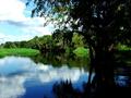
Myakka State Parkby ArpeggioAngelComment by Aeroglyphics: Love the colors especially the reflection on the water. Wish you could see a little more detail in the shadow area on the lower right hand side of the photo. |
 Photographer found comment helpful. Photographer found comment helpful. |
| 05/18/2006 12:52:56 PM |
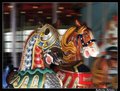
carouselby ArpeggioAngelComment by Givemeashot: Very Framable picture i like them all in this series.... I like the motion on this as well the only thing i would pick at is the blue seat... Bu t i do like these a lot nice work.. |
| Photographer found comment helpful. |
| 05/17/2006 03:22:11 PM |
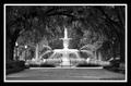
Savannah Fountainby ArpeggioAngelComment by Givemeashot: Keep Seeing this one and wanted to comment....
Well i love this photo alot!! I dont see anything wrong at all!! Love the the tones.... Black and white adds an old look i like that as well......that said.... Try a test on the crop right above the park bench.. I duno if it would look good or not just a test.... i was thinking if there was a matching light poll on the other side it would look well duno=) any ways I love it great job! |
| Photographer found comment helpful. |
| 05/11/2006 02:10:20 PM |
|
| Photographer found comment helpful. |
| 05/10/2006 05:22:40 PM |
Old Gloryby ArpeggioAngelComment by noodleboy: i love the sharpness and textures, but i think it would have looked better using the rule of thirds or taken vertically. Don't get me wrong, the image still looks great. |
| Photographer found comment helpful. |
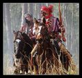
| 05/06/2006 01:09:31 PM |
Seminole Warriorsby ArpeggioAngelComment by rox_rox: Amazing shot, Katherine! I gave this an 8 and was very impressed by it. Even better, now that I know how it was captured. Keep up the good work! |
| Photographer found comment helpful. |
| 05/02/2006 06:15:48 PM |
|
| Photographer found comment helpful. |
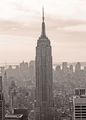
| 04/28/2006 04:24:06 PM |
Empire State Buildingby ArpeggioAngelComment by Rikki: I have to agree that this is definitely a very centered image. The horizon is a bit off tilt but that's ok. I wonder had the tower been to either left or right showing more of the ground plane, would this be better? I think the shadows could be brought out further and really make this stand out. Great eye on this shot. |
| Photographer found comment helpful. |
| 04/28/2006 09:05:40 AM |
|
| Photographer found comment helpful. |
| 04/27/2006 11:23:15 PM |
|
| Photographer found comment helpful. |
Home -
Challenges -
Community -
League -
Photos -
Cameras -
Lenses -
Learn -
Help -
Terms of Use -
Privacy -
Top ^
DPChallenge, and website content and design, Copyright © 2001-2026 Challenging Technologies, LLC.
All digital photo copyrights belong to the photographers and may not be used without permission.
Current Server Time: 07/17/2026 10:46:28 PM EDT.