| Image |
Comment |
| 09/11/2005 07:38:28 PM |
Lone Sentinentalby phinbobComment by marmalade1121: I really like this shot. I do believe that it could use some lightening up in the foreground to bring out that plant life down there...my eye is really drawn to those plants and some PS work would fix that right up, I think. |
| 09/11/2005 07:38:21 PM |
Lone Sentinentalby phinbobComment by BobsterLobster: Seems like you're undecided if you want it to be a silhouette or not. I think you should have exposed for the sky, and lost the shadow detail. Contrast seems a bit washed out. I don't think the silhouettes at the bottom of the cactus are simple and striking enough for the composition to be a real winner. I'd play around with duotones to bring a little more mood to this b&w. |
| 09/11/2005 05:54:13 PM |
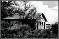
Times Forgottenby phinbobComment by Tammer: You've definitely created high contrast with a photo-editing program, but the sky seems....overly done, and it seems to border on a pencil type drawing. |
| 09/10/2005 09:56:51 PM |
|
| 09/10/2005 04:37:26 PM |
Times Forgottenby phinbobComment by puzzled: This is a beautiful scene. I'd like to see sharper focus on the front of the house, rather than the upper right clouds. The sky is a bit blown out, which distracts from the rest of the scene. Nice job with the colors. They're subtle and help give a contrasty feel to the image. |
| 09/10/2005 02:00:31 PM |
|
| 09/10/2005 06:30:18 AM |
Times Forgottenby phinbobComment by notonline: The angle of the horizon is crooked. Perhaps a 1- 2 degree rotation CCW could have helped this. Good luck in this challenge. <7> Would have been 8 or 9 if it were straightened. |
| 09/10/2005 01:31:49 AM |
|
| 09/09/2005 09:59:09 PM |
Times Forgottenby phinbobComment by Jutilda: I love old buildings. I think I'd like this a bit more if shot from an unusual angle, although this does showcase the doors and windows of the back and the lighting helps with the contrast. |
| 09/07/2005 08:27:55 PM |
|
Home -
Challenges -
Community -
League -
Photos -
Cameras -
Lenses -
Learn -
Help -
Terms of Use -
Privacy -
Top ^
DPChallenge, and website content and design, Copyright © 2001-2026 Challenging Technologies, LLC.
All digital photo copyrights belong to the photographers and may not be used without permission.
Current Server Time: 07/16/2026 01:41:08 PM EDT.