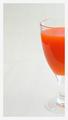
DPChallenge: A Digital Photography Contest You are not logged in. (log in or register
 
Browse Settings
Currently viewing:
Registered Useragwright

Show comments:

Per page:

Order:

Comments:


Comments Received by agwright
Pages:   ... [215] [216] [217] [218] [219] [220] [221] ... [250]
Showing 2171 - 2180 of ~2497
Image Comment
First Things First
05/28/2003 02:28:13 AM
First Things First
by agwright

Comment by shadow:
i like the details reflected on the kettle.
Photographer found comment helpful.
"Good Morning ... Just Opening"
05/27/2003 10:44:20 PM
"Good Morning ... Just Opening"
by agwright

Comment by kavamama:
Love it, wouldn't change a thing!
Photographer found comment helpful.
"Good Morning ... Just Opening"
05/27/2003 08:36:36 PM
"Good Morning ... Just Opening"
by agwright

Comment by David Ey:
I like your lighting...especially under the awning
Photographer found comment helpful.
"Good Morning ... Just Opening"
05/26/2003 10:56:20 AM
"Good Morning ... Just Opening"
by agwright

Comment by progersct:
Nice job! I love the composition and use of duotone. The light is also wonderful.
Photographer found comment helpful.
"Good Morning ... Just Opening"
05/26/2003 01:46:08 AM
"Good Morning ... Just Opening"
by agwright

Comment by ChrisW123:
Maybe a little too much tonal color to it. The contrast is very good.
Photographer found comment helpful.
Petals
05/25/2003 11:14:13 AM
Petals2nd Place
by agwright

Comment by mcmurma:
Ag, this photo really underscores the raw beauty of simplicity. Nicely done, and congrats on your first ribbon!
Photographer found comment helpful.
Petals
05/24/2003 09:48:08 PM
Petals2nd Place
by agwright

Comment by magnetic9999:
this pic is amazing. i keep coming back to it as the colors and composition keep catching my eye from the front page :)
Photographer found comment helpful.
Carrot Juice
05/24/2003 03:05:40 PM
Carrot Juice
by agwright

Comment by FranziskaLang:
A Comment From The Critique Club

Hi Tony,

first of, let me congratulate you on your ribbon in the primary color challenge - your entry was beautiful and well spotted ... no setup ... a well deserved win!

And here, another beautiful image of yours, but totally different. I was instantly captured by the beautiful simplicity of the image, and how I could simply focus on what's there, no distractions, I really like it! Plus, it clearly contains orange, so it meets the challenge as well :)

COMPOSITION / CONTENT - The composition with the negative space and showing just half the glass works really well here, especially because the negative space has a very unobtrusive off-white color but has some texture that gradually disappears to the top of the photo but is clearly visible in the bottom half. The nice strong orange color of the carrot juice (yucky taste, but it does look good!) is emphasized further by the muted color of its surroundings.

CAMERA WORK / TECHNICAL - Nice focus, nice colors in your photo. Photographing glass is really hard, there are always reflections and such going on. You didn't do a bad job, but there is definitely room for improvement in your photo, especially because it's so simple and clean that reflections are drawing the viewer's attention even more. If you could have avoided the reflection just in the juice (which makes one half look lighter than the other), I'm sure the photo would look even better. I backlit my entry for the secondary color challenge (which I don't think would be suitable for your setup because the juice would be totally too dark), but the other thing I did was stand behind the camera (I used the tripod and timer to take the photo) with a black sheet of cardboard to eliminate some of the reflections in the background. I think that would've helped here, too.

POST-PROCESSING - No obvious flaws are always a sign of good post-processing, so you did well here, too. :) I agree with your choice of a very simple border, but I am not convinced that pure white was the best choice for it as it emphasizes that your background is more beige than white. I honestly don't have a suggestion as to what would've worked better. A one-pixel inner border in a different color sometimes just helps with the separation and then the white might work better. Maybe something for you to play around with further ...

Personally, I think your image should've scored higher. The reason it didn't might be the lack of a "wow" factor for people (based on the comments) and the strong competition that it was up against. I was just looking at the image some more (I often think of how can I copy the idea but still make it my own) and what strikes me is that the tip of a carrot peeking in from the bottom left of the image might have added a little bit of tension to the shot. Clearly, it wouldn't be the shot you had in mind, but an interesting variation to consider nonetheless, and you never know, something like that might just increase the wow-factor people felt was lacking a bit. I wouldn't change the composition because I really like it, but it might be fun to play around with some of the suggestions, too.

Please let me know if you have any questions or comments about this review.

Franziska.
Photographer found comment helpful.
Petals
05/21/2003 10:35:10 PM
Petals2nd Place
by agwright

Comment by robbieh:
Nice macro. The colors are nicely saturated and I like the composition. Congrats on placing!
Photographer found comment helpful.
Petals
05/21/2003 04:17:35 PM
Petals2nd Place
by agwright

Comment by timj351:
Critique Club critique by Tim Jensen

First off, congratulations on your award. This photo is very deserving of it.

My first impression was the gorgeous colors in this photo. It certainly meets the challenge very well. I'm sure you boosted the saturation and levels a little to make it pop out but it still looks natural. I like the highlights near the edges of the pedals. They really help to define that edge and the separation between the flower and the blue sky.

The lighting is very good in the way that it creates some nice dark shadows on the pedals and at the same time highlights the center area. Each element of the photo from the sky to the individual parts of the flower are distinctly visible with the right amount of light.

The focus is pretty good, excellent in most of the image. Since it is sharp in nearly every area of the flower I would like to see that taken even further by decreasing the aperture size to the smallest size of F8 (whatever the smallest is on your camera) to try to get that lower pedal more in focus. Hey, it's such a great photo that I am grasping at straws to come up with something to nitpick.

The composition is very appropriate. It is a common composition for these kinds of flowers but that is because it works very well. The square cropping was definitely the way to go.

You executed this image very well and produced a very clean, colorful, and dramatic photo that I'm sure would look great on just about any wall. Good job.

Tim
Photographer found comment helpful.
Pages:   ... [215] [216] [217] [218] [219] [220] [221] ... [250]
Showing 2171 - 2180 of ~2497


Home - Challenges - Community - League - Photos - Cameras - Lenses - Learn - Help - Terms of Use - Privacy - Top ^
DPChallenge, and website content and design, Copyright © 2001-2025 Challenging Technologies, LLC.
All digital photo copyrights belong to the photographers and may not be used without permission.
Current Server Time: 09/26/2025 11:50:35 PM EDT.