DPChallenge: A Digital Photography Contest You are not logged in. (log in or register
 
Browse Settings
Currently viewing:
Registered UserEvanH

Show comments:

Per page:

Order:

Comments:


Comments Received by EvanH
Pages:   ... [51] ... [60]
Showing 471 - 480 of ~598
Image Comment
Broken Corn
02/11/2006 02:34:06 AM
Broken Corn
by EvanH

Comment by hotpasta:
i like this...nice depth and lighting
Broken Corn
02/10/2006 11:28:06 PM
Broken Corn
by EvanH

Comment by kbhatia1967:
This would work better in shadows or silhouette challenge! 5.
Broken Corn
02/10/2006 10:43:22 AM
Broken Corn
by EvanH

Comment by tommyd65:
Hi. This one was tough. I like the shadowy figures in the background and the composition itself, but the subject (corn stalk?) is a little too dark. I realize it's tough to light from that side of the sun. Perhaps if more was backlit (like the bottom of it was).
Broken Corn
02/08/2006 06:33:15 PM
Broken Corn
by EvanH

Comment by sandabella:
Nice lighting and angle
Broken Corn
02/08/2006 01:48:04 PM
Broken Corn
by EvanH

Comment by jfwolpert:
i like this composition!
Broken Corn
02/08/2006 02:26:07 AM
Broken Corn
by EvanH

Comment by Kaizer:
Really a strong image. 10 from me.
Red Sea
01/10/2006 02:47:43 PM
Red Sea
by EvanH

Comment by HBunch:
*Critique Club*

In response to your request, here if your in depth critique from the Critique Club.

I'm not sure if you just don't use the 'this critique is helpful' feature, or if you really dodn't find these critiques helpful, but if it's the latter, I'm sure my critique wont be of much help to you either, but I can certainly try.
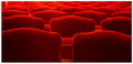
The very first thing I notice is the size. 447x216. That's a good 200 pixels short of typical DPC challenge entry viewing size. The small size (while it may help hide defects) makes it difficult to really appreciate the image. You placed really well in the challenge, but I'd like to bet you could have gotten 20 places higher with a larger image.
Now, from what I do see of the image, the colors are stunning. Very nice reds. Ranging from a darker red to a bright red. I love the way it sort of fades from front to back. Very nice depth in the photo.
Focus appears good, but maybe a tad soft, but again hard to really determine with the size.
I like the positioning of the chairs within the photo. Your first chairs start about 1/2 way up in the photo, and usually that doesn't appeal well to me, however, it works very nicely here because of the fade I think.
Overall the image has a lot of visual appeal, but suffers from size. ~Heather~
Red Sea
01/03/2006 11:54:10 AM
Red Sea
by EvanH

Comment by Paul Hakimata:
Very nice colors and shades. The simplicity is great and very effective.
Red Sea
01/02/2006 09:37:54 PM
Red Sea
by EvanH

Comment by BaldurT:
That's way cool. Love that red hot RED. Great shot and I think a 10.
Red Sea
01/02/2006 09:25:32 PM
Red Sea
by EvanH

Comment by banmorn:
I did something like this in a church recently....like your perspective and the wonderful glow at the tops of the seats. Nice pattern as well.
Pages:   ... [51] ... [60]
Showing 471 - 480 of ~598


Home - Challenges - Community - League - Photos - Cameras - Lenses - Learn - Help - Terms of Use - Privacy - Top ^
DPChallenge, and website content and design, Copyright © 2001-2025 Challenging Technologies, LLC.
All digital photo copyrights belong to the photographers and may not be used without permission.
Current Server Time: 08/13/2025 02:08:19 AM EDT.