| Image |
Comment |
| 10/05/2005 01:07:36 AM |
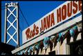
Waking Up With Redby rasdubComment by Rikki: The "real" San Francisco treat :) Too bad the "E" was cut off. Great colors on this one and nice tight crop. 7 |
 Photographer found comment helpful. Photographer found comment helpful. |
| 10/04/2005 12:28:53 AM |
|
| Photographer found comment helpful. |
| 10/03/2005 04:51:40 PM |
Marembaby rasdubComment by SJCarter: It's a great shot, but I'm not sure that the tones are the best choices for selective desat in this particular shot. Makes him look very unnatural. You might also consider cropping off more on the right to take him out of the center. The woman in the background is nice, but the guy is a distraction IMHO. Great focus on Maremba. |
| Photographer found comment helpful. |
| 10/03/2005 01:58:28 PM |
|
| 09/28/2005 09:39:25 PM |
Catch Of The Dayby rasdubComment by madison461: Originally posted by madison461:
Do they take internet orders?
Very cool shot. I love the clarity of the shot and the action of the fish mongers. I hope you put the info on this place in your description! |
I say again (LOL) do they take internet orders? This place looks absolutely AWESOME!
I love this shot! |
| Photographer found comment helpful. |
| 09/26/2005 04:32:31 PM |
|
| Photographer found comment helpful. |
| 09/26/2005 04:12:35 PM |
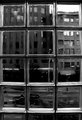
seattle window sharpened.jpgby rasdubComment by glad2badad: This is nice. A very interesting image to look at. Detail inside the blocks is good and the tonal range for the whole image is good. Two things I find distracting and I don't have any good suggestions for a fix: 1) The area between the panes appear oversharpened - a little jaggy. It could be the resizing done for forum posting. 2) Cropping. This image is a tough one to "draw the line". Personally, it feels a bit tight on the sides (maybe a black border would help it breath a little. If it was mine I might also crop at the bottom to take out the partial block row as it doesn't balance with the top of the image.
Good eye to see this and capture it. Well done. |
| Photographer found comment helpful. |
| 09/26/2005 02:25:12 AM |
|
| Photographer found comment helpful. |
| 09/26/2005 02:23:01 AM |
Vinyl-Less DJby rasdubComment by mcmurma: This is a good composition, but it is too dark. I like that you cropped so close, it gives the perspective you were looking for. But I also feel that something is missing.... a little movement on the subject hand perhaps. |
| Photographer found comment helpful. |
| 09/24/2005 06:20:56 PM |
|
| Photographer found comment helpful. |
Home -
Challenges -
Community -
League -
Photos -
Cameras -
Lenses -
Learn -
Help -
Terms of Use -
Privacy -
Top ^
DPChallenge, and website content and design, Copyright © 2001-2026 Challenging Technologies, LLC.
All digital photo copyrights belong to the photographers and may not be used without permission.
Current Server Time: 07/17/2026 03:48:35 PM EDT.