| Image |
Comment |
| 06/03/2006 11:48:39 AM |
|
| 06/03/2006 04:41:07 AM |
|
| 06/02/2006 10:09:12 PM |
|
 Photographer found comment helpful. Photographer found comment helpful. |
| 06/02/2006 05:07:38 PM |
|
| Photographer found comment helpful. |
| 06/02/2006 11:27:19 AM |
|
| Photographer found comment helpful. |
| 06/02/2006 09:48:31 AM |
A Glass of Wine with a Bottle to Goby chaliceComment by KiwiShotz: Have studied this for a bit and have come to think that the bottle without the glass would have been stronger. The glas has blown out on the left and taken over your image whereas the bottle has some stunning features in the frosting and the green glow where the shape has focussed the light |
| Photographer found comment helpful. |
| 06/02/2006 12:53:17 AM |
Architectural Colorsby chaliceComment by Balko: Using a new formula....
0-2 Meets the Challenge = 2
0-2 Technical Merit = 1
0-4 Interest/Creativity = 2
0-2 The "wow factor" = 0
Final score: 5
Too divided in half - better to have one or the other predominate. |
| Photographer found comment helpful. |
| 06/01/2006 10:42:52 PM |
Failure: Another Loser DPC Score!by chaliceComment by ericwoo: --Trading Post Comment--
Camera Work/Technical: Very nice focus, depth of field and great toning to give a very secluded feel to the photograph. I think you lost a little detail in the black shirt, but that's easily remedied with a slightly longer exposure.
Lighting: I like it. The lighting works very well to provide you with some very interesting tines in this one.
Composition/Content: Not bad, but I'd like to see where that right arm goes. It really pulls me out of the frame, and there is nothing in that area to get me back into it.
My Opinion: I said earlier that it makes me think too much. That might have been after hanging out with my buddy Sam Adams too long that particular evening. I think that it's very creative, and it does portray failure. I do not believe that it is a sub-5 photograph, but I also don't think that it was exactly what the voters were looking for.
Eric
|
| Photographer found comment helpful. |
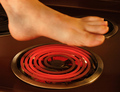
| 06/01/2006 10:33:01 PM |
Hot Footin' Itby chaliceComment by ericwoo: --Trading Post Comment--
Camera Work/Technical: Very nice exposure control, and I think that the motion blur adds to the overall feel of the photograph. Perfect white balance, and great choice of aperture to keep the entire frame in focus.
Lighting: The lighting in this one works very well. You did a very nice job bringing out the red of the burner, and your skin tones all look properly lit.
Composition/Content: Very interesting. The leg and foot serve very well to draw the viewer's eye into the frame, and the burner works well to keep it there. The toenails are too much. They really stand out against the motion blur of the foot. I think that I would have left them dirty.
My Opinion: You met the challenge, but, as mentioned before, feet do not normally score very well. There are some small improvements that would make the shot a better photograph, but I don't think your scoring would benefit much either way. This is an odd place sometimes.
Eric
|
| Photographer found comment helpful. |
| 06/01/2006 10:25:52 PM |
Man in a Panama Hatby chaliceComment by ericwoo: --Trading Post Comment--
Camera Work/Technical: I agree with Artyste. This one is lacking a little focus. Focus is the most difficult part to master when putting together a self-portrait, especially with a background that is empty. I do like the warmth from the white balance that you chose, and I think that the depth of field would be nice if the main subject was in focus.
Lighting: I like it! I would like to see you catchlights dodged a little to really bring them out, but I like the effect you created with your light source. You achieved a very nice balance between highlights and shadows.
Composition/Content: Very nice composition here. I like the position that you were captured in, and even the cropping of the hat works very well.
My Opinion: I recognized you right away, so you met the challenge perfectly. With a bit more attention on the focus, I think that this one would have been close to a 6. Nice work with the lighting, just get that focus worked out.
Eric
|
| Photographer found comment helpful. |
Home -
Challenges -
Community -
League -
Photos -
Cameras -
Lenses -
Learn -
Help -
Terms of Use -
Privacy -
Top ^
DPChallenge, and website content and design, Copyright © 2001-2026 Challenging Technologies, LLC.
All digital photo copyrights belong to the photographers and may not be used without permission.
Current Server Time: 06/22/2026 01:23:19 AM EDT.