| Image |
Comment |
| 02/10/2009 04:15:06 AM |
|
 Photographer found comment helpful. Photographer found comment helpful. |
| 02/09/2009 06:46:54 PM |
|
| Photographer found comment helpful. |
| 02/08/2009 07:39:51 PM |
|
| Photographer found comment helpful. |
| 02/08/2009 02:13:40 PM |
|
| Photographer found comment helpful. |
| 02/08/2009 12:29:01 PM |
|
| Photographer found comment helpful. |
| 02/06/2009 03:24:41 PM |
|
| Photographer found comment helpful. |
| 02/05/2009 09:24:27 PM |
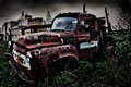
04 - Truckinby VitaminBComment by Neil: VERY COOL! I love the processing on this, and the shot (in this version!).
One thing I'd suggest is try to make the vignette in the sky appear less painted, and more of a gradient.
But this is a winning shot! |
| Photographer found comment helpful. |
| 02/05/2009 12:18:43 PM |
04 - Truckinby VitaminBComment by Melethia: Love what you did to the truck! Sky is perhaps a bit too burnt for my taste but I understand your reason for doing it and it does kinda match the mood of the edit. |
| Photographer found comment helpful. |
| 02/05/2009 03:20:27 AM |
|
| Photographer found comment helpful. |
| 02/03/2009 08:48:11 PM |
04 - Truckinby VitaminBComment by jomari: Love your processing. Love old trucks, and you have really done a wonderful job of accentuating the aged textures on this one. |
| Photographer found comment helpful. |
Home -
Challenges -
Community -
League -
Photos -
Cameras -
Lenses -
Learn -
Help -
Terms of Use -
Privacy -
Top ^
DPChallenge, and website content and design, Copyright © 2001-2026 Challenging Technologies, LLC.
All digital photo copyrights belong to the photographers and may not be used without permission.
Current Server Time: 06/22/2026 01:26:30 PM EDT.