| Image |
Comment |
| 01/27/2003 03:08:04 PM |
|
| 01/27/2003 01:51:56 PM |
|
| 01/27/2003 04:18:17 AM |
Windows of Opportunityby CreativeFlyPhotoComment by SharQ: Hehe.. A truly creative solution to the problem. I played around with a few goofy puns on "window" and "door" as well, but this is better than anything I could come up with. Artistically, the limited DOF and the selected sharpness (or is it Photoshop? ;) really does it for me. (9) |
| 01/27/2003 12:44:58 AM |
|
| 01/26/2003 01:36:52 AM |
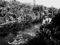
Nature at it's best ...by CreativeFlyPhotoComment by magnetic9999: Critique Club Review
Very high contrast image. Trying to reconcile the title with what I'm seeing, and I'm not really sure why you chose to present it in B and W. It's almost as if you're being ironic, when you say it's 'at it's best'.
You've got a blown out sky, and sharpness seems a little low...The picture is really busy with all the tiny details, but there's not really a clear or specific subject. With all the contrast, it's got an old movie feel to it.
I'm interested to hear more about what you were trying to do. :)
|
 Photographer found comment helpful. Photographer found comment helpful. |
| 01/26/2003 12:29:38 AM |
Happy babyby CreativeFlyPhotoComment by indigo997: Very cute shot, but maybe not the best fit for the challenge. Seems more happy than humor to me. I'm bettin that's why it scored so low. No better reason really. The focus might be a tad soft and the lighting isn't even ... but the composition is good. Not sure I like that her fingers are cut off but that's minor. Great expression capture. I like how you filled the frame. Do use the full 150kb! |
| Photographer found comment helpful. |
| 01/19/2003 10:06:40 PM |
|
| Photographer found comment helpful. |
| 01/19/2003 06:33:55 PM |
|
| Photographer found comment helpful. |
| 01/19/2003 03:53:51 PM |
Nature at it's best ...by CreativeFlyPhotoComment by timj351: It was an interesting decision to make this a black and white. Was there some specific colors that you didn't like? I think I would have preferred it in color. The large dark area of bushes on the right side is distracting. It feels too dominating of the scene. I do really like the lilipads in the water as well as the fine detail in the trees and around the building. The bright areas appear a little too bright and I wish the sky could be darker. I like the composition in the way that the river leads the eye to the building. Technically it looks very good, clean and sharp. 6 -T |
| Photographer found comment helpful. |
| 01/18/2003 05:37:30 PM |
Love Potion #9by CreativeFlyPhotoComment by emorgan49: oh he was correct - It was black! I just remembered the words - Oh but red is sooo much better. Red for love, right?
lalalalla and looked like India Ink
I held my nose
I closed my eyes
I took a drink |
| Photographer found comment helpful. |
Home -
Challenges -
Community -
League -
Photos -
Cameras -
Lenses -
Learn -
Help -
Terms of Use -
Privacy -
Top ^
DPChallenge, and website content and design, Copyright © 2001-2026 Challenging Technologies, LLC.
All digital photo copyrights belong to the photographers and may not be used without permission.
Current Server Time: 06/12/2026 01:55:01 PM EDT.