| Image |
Comment |
| 06/16/2005 08:46:30 PM |
|
 Photographer found comment helpful. Photographer found comment helpful. |
| 06/16/2005 08:36:36 PM |
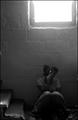
Lossby LadeeMComment by mesmeraj: I bet youre getting a fair bit of flack for the glarefrom the window? I think it adds to the emotion of the image - lightness outside, darkness within. Just as we often put on a brave face for the world outside, when we are torn appart within. |
| Photographer found comment helpful. |
| 06/16/2005 07:24:36 PM |
Lossby LadeeMComment by _Io_: Overblown exposure on the window distract from this otherwise powerful image. 6 |
| Photographer found comment helpful. |
| 06/16/2005 06:58:17 PM |
Lossby LadeeMComment by Bebe: Excellent take on the challenge. The grimness of the setting, the model's pose and the lighting all convey darkness to me. |
| Photographer found comment helpful. |
| 06/15/2005 11:08:15 AM |
Lossby LadeeMComment by bhound: IMO cropping to just above the window sill would have dramatically improved this shot. In all other aspects this is great but the brightness from the window is really distracting. |
| Photographer found comment helpful. |
| 06/15/2005 06:56:33 AM |
|
| Photographer found comment helpful. |
| 06/15/2005 01:39:34 AM |
Lossby LadeeMComment by Jutilda: No need for words. This tells it all. Nice lighting. Very effective. |
| Photographer found comment helpful. |
| 06/15/2005 12:11:01 AM |
|
| Photographer found comment helpful. |
| 06/14/2005 12:36:26 AM |
|
| Photographer found comment helpful. |
| 06/13/2005 02:25:35 PM |
Commitmentby LadeeMComment by SJCarter: * Greetings from the Critique Club *
First of all, let me say I remember this image from the Decisions Challenge (fondly). I think you really used B/W to your advantage and the softness and clarity of the image are great. I think you could crop out a little more of the upper left and/or process it a little more (reduce backlighting, play with contrast, etc.) - there seems to be a bit of glare on the fabric there.
The composition is good, but I think could be improved even more by perhaps expanding the crop to the bottom & right. Don't get me wrong - it's a nice rock & should be shown off. I just think that you might accent it more by slightly increasing the size of your crop in that direction.
Very nice shot.
Just my 2 cents...
Jimmy
|
| Photographer found comment helpful. |
Home -
Challenges -
Community -
League -
Photos -
Cameras -
Lenses -
Learn -
Help -
Terms of Use -
Privacy -
Top ^
DPChallenge, and website content and design, Copyright © 2001-2026 Challenging Technologies, LLC.
All digital photo copyrights belong to the photographers and may not be used without permission.
Current Server Time: 07/16/2026 05:28:36 AM EDT.