| Image |
Comment |
| 05/05/2003 01:02:46 AM |
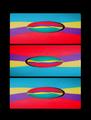
Baltimore Inner Harborby RefocusedComment by Wes: The text on this might have looked better in either the top left or top right corner instead of dead center. The image is nice, but not too many details can be made out. it does have that postcard feel to it though. The blue border seems slightly out of place a white one might have been better. Overall not bad. |
 Photographer found comment helpful. Photographer found comment helpful. |
| 05/04/2003 09:22:41 PM |
|
| Photographer found comment helpful. |
| 05/04/2003 05:08:17 PM |
|
| Photographer found comment helpful. |
| 05/04/2003 04:40:23 PM |
|
| Photographer found comment helpful. |
| 05/04/2003 01:16:10 PM |
|
| 05/04/2003 07:43:47 AM |
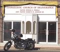
Deliveranceby RefocusedComment by Fiver: Is the focus of this Photo the Bike or the Church? They seem separate entities in this photo. Maybe if you shot it at a different angle, or found someother way to tie the two more together... (6) |
| Photographer found comment helpful. |
| 05/04/2003 02:03:07 AM |
Deliveranceby RefocusedComment by frisca: what a great find! :) I wonder if the two riders of this "hell machine" are inside that church? LOL I would have preferred a little more saturation on that yellow valance, just because it contrasts nicely against the dark bricks, nice shot! |
| Photographer found comment helpful. |
| 05/03/2003 05:13:51 PM |
Dawnby RefocusedComment by ClubJuggle: *Critique Club*
FIRST IMPRESSION: Great subject, great light, a little overexposed.
CHALLENGE: Meets the challenge without being cliché.
COMPOSITION: Good composition that draws the viewer to the subject in the frame and sets it off from the background elements.
TECHNICAL: Depth of field is good but I feel the shot is a bit overexposed. This may have benefited from a moderately shorter exposure time, or a levels adjustment in post-processing.
CONCLUSION: A good photograph, certainly better than average. A little more post-processing may help bring this shot to its full potential.
Thanks for sharing and good luck in future challenges! |
| 05/02/2003 10:41:05 AM |
Deliveranceby RefocusedComment by edhendricks: Is this supposedly a culture contrast? I like the idea, though something seems to be missing. Not quite a head on shot, which I don't think would work here anyway, but not enough of an angle to give a slanted perpective. |
| Photographer found comment helpful. |
| 05/01/2003 11:36:39 AM |
|
| Photographer found comment helpful. |
Home -
Challenges -
Community -
League -
Photos -
Cameras -
Lenses -
Learn -
Help -
Terms of Use -
Privacy -
Top ^
DPChallenge, and website content and design, Copyright © 2001-2026 Challenging Technologies, LLC.
All digital photo copyrights belong to the photographers and may not be used without permission.
Current Server Time: 07/21/2026 07:35:53 PM EDT.