| Image |
Comment |
| 10/27/2003 12:11:14 PM |
|
 Photographer found comment helpful. Photographer found comment helpful. |
| 10/27/2003 12:04:49 PM |
|
| Photographer found comment helpful. |
| 10/27/2003 10:44:45 AM |
|
| Photographer found comment helpful. |
| 10/27/2003 10:12:18 AM |
|
| Photographer found comment helpful. |
| 10/27/2003 05:23:50 AM |
|
| Photographer found comment helpful. |
| 10/26/2003 09:42:05 PM |
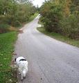
Lostby RefocusedComment by LucidLotus: Good use of the lighting, focus is good overall. I like the concept, fits the challenge, but compositionally I think I would've preferred to see the dog further along the road. Taken so close, the feeling of being lost is reduced for me. I really like the distance shown. Very nice. 7 |
| Photographer found comment helpful. |
| 10/26/2003 08:15:30 PM |
|
| Photographer found comment helpful. |
| 10/26/2003 01:11:47 PM |
Lightby RefocusedComment by GeneralE: I like photos which meet the challenge in multiple ways. I've used a similar diagonal black/white composition myself; I might have cropped it to the edge of the shadow on the right as it seems just a touch unbalanced now.
If it's cropped so tightly on the left because the feather's actually suspended instead of falling, I have an idea for doing that which might allow more background on the left. If the feather's falling, then never mind ... I don't think I can do that. |
| Photographer found comment helpful. |
| 10/26/2003 12:01:01 PM |
Lostby RefocusedComment by amsmyth: this has a very good "alone" feel, the dog looks a bit lost and the road is niuce. |
| Photographer found comment helpful. |
| 10/26/2003 09:16:40 AM |
|
| Photographer found comment helpful. |
Home -
Challenges -
Community -
League -
Photos -
Cameras -
Lenses -
Learn -
Help -
Terms of Use -
Privacy -
Top ^
DPChallenge, and website content and design, Copyright © 2001-2026 Challenging Technologies, LLC.
All digital photo copyrights belong to the photographers and may not be used without permission.
Current Server Time: 07/25/2026 12:42:24 PM EDT.