| Image |
Comment |
| 04/30/2003 07:14:29 PM |
Rite of Passageby DougPazComment by wingy: This series seems compositionally unbalanced. I see how you were trying to achieve a rough symmetry here, but by doing so you lose the chronological theme that you present, as it is highly unnatural to look first at the left frame, then the right, and then the center. This is especially difficult to see as valuable because the result isn't truly symmetrical anyway, due to the partial blooming of the third frame. Also, the framing of this shot seems somewhat awkward, with the excess of white space above the shots. I do like the red background, which provides a good contrast for the flower. Individual these shots aren't enough to stand out as unique, and I admire the attempt at a unique presentation, but I don't think it worked out very well. 4 |
| 04/30/2003 12:30:24 PM |
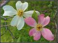
Double Dogwoodby DougPazComment by justine: CC Hello and Howdy DougPaz
Fits The Challenge-Yes
Composition-Fair
Background-Good
My Opinion-I like the combination of these two. Very nice. Good color, light. I think the shot is good but it's hard not to see the fact that the flowers are rusted/old. They will turn brown from age, rain or even touching them. I know it's not your fault. This is not a bad shot and I don't mean to infer that at all it's an attractive photo. |
| 04/30/2003 11:20:17 AM |
|
 Photographer found comment helpful. Photographer found comment helpful. |
| 04/29/2003 07:57:42 AM |
Rite of Passageby DougPazComment by DigiPique: My favorite of the flower triptychs this week - perfect choice of bg color and shading, wonderful soft lighting, technically excellent (to my eyes!) |
| Photographer found comment helpful. |
| 04/28/2003 02:40:04 PM |
|
| 04/28/2003 01:03:10 PM |
Rite of Passageby DougPazComment by albright1: The photos are lovely, but somehow that plain white background detracts from the overall grace of your images. |
| Photographer found comment helpful. |
| 04/28/2003 12:36:31 PM |
|
| Photographer found comment helpful. |
| 04/28/2003 11:33:00 AM |
Rite of Passageby DougPazComment by Kavey: Great idea and good colour and light. Choice of background colour just right. I would rather have the left and right images the same height as the central one. The white space behind just makes an odd and unappealing shape for me. |
| Photographer found comment helpful. |
| 04/28/2003 01:43:41 AM |
|
| Photographer found comment helpful. |
| 04/28/2003 12:05:05 AM |
Easter's Overby DougPazComment by breezy: Because the grass is such a strong beautiful green, I would almost like this picture better without the eggs...but it's just my opinion :) Still, it's a well done photo |
| Photographer found comment helpful. |
Home -
Challenges -
Community -
League -
Photos -
Cameras -
Lenses -
Learn -
Help -
Terms of Use -
Privacy -
Top ^
DPChallenge, and website content and design, Copyright © 2001-2026 Challenging Technologies, LLC.
All digital photo copyrights belong to the photographers and may not be used without permission.
Current Server Time: 06/15/2026 12:27:46 AM EDT.