| Image |
Comment |
| 01/31/2003 02:18:44 PM |
|
| 01/31/2003 12:39:24 PM |
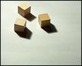
Three Squareby DougPazComment by PaulMdx: Composition: Good. Maybe subject is slightly too high?
Technical: Good focus and quality. Looks a little over sharpened (noise around the shadows?). Nice lighting too.
Meets challenge: Yes
Overall impression: Nice simplicity and a generally good pic. 7 |
| 01/30/2003 08:24:33 PM |
Three Squareby DougPazComment by Jacko: Three squares? I see 10 if you count the one in the shadow. lol Nice simple composition. Good luck. Jacko. 8 |
 Photographer found comment helpful. Photographer found comment helpful. |
| 01/30/2003 09:00:04 AM |
"Snow" Outletby DougPazComment by magnetic9999: Critique Club Review
Composition: Excellent. One of the strongest features of the picture. The strong shape and placement of the sign is balanced by the unique sunlit, snow covered tree branches. Good angle of view on the sign.
Technical: Focus is good and the deep DOF works well here. I don't think you can control aperture on that camera but if you can, I'd be curious what a shallow DOF would look like? I think that the pic would actually be a tad stronger if you had used some fill flash on the sign. It still looks good even backlit and obviously the snow is providing a lot of fill reflection but these signs are designed to flouresce in a strong light and it tends to make them really pop. As it is, the tree branches are almost primary and the sign is almost secondary. Also, when I look closely at the sign, it seems as if the focus on the letters is actually a tiny bit soft, yet the tree is really sharp, as if your AF hit the tree and missed the sign.
Post-Processing: Looks good. The only thing that stands out is the branches look like they might be a tad oversharpened.
All in all a great picture that might benefit from a few small tweaks! Good job! :) |
| Photographer found comment helpful. |
| 01/29/2003 11:55:37 PM |
|
| Photographer found comment helpful. |
| 01/29/2003 02:39:13 PM |
Three Squareby DougPazComment by Allen: I really like how the lighting you used on this picture came out. I think that alot more intrest would have been created by focusing closer on the squares and elminating all the white space. Good Work |
| Photographer found comment helpful. |
| 01/29/2003 12:18:36 PM |
|
| Photographer found comment helpful. |
| 01/29/2003 09:58:32 AM |
|
| Photographer found comment helpful. |
| 01/28/2003 05:33:58 PM |
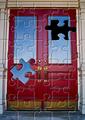
Puzzling Doorby DougPazComment by Alecia: sweet!!!!!! the photograph would be cool even with out the puzzle--i really like the contrast of the red door with the surrounding neutral colors. but of course i have to know how you did the puzzle! very creative! 10 |
| Photographer found comment helpful. |
| 01/28/2003 04:40:45 PM |
Puzzling Doorby DougPazComment by mariomel: I really like this shot. How was this done? Is it a picture of a puzzle, or is this some kind of PS effect. |
| Photographer found comment helpful. |
Home -
Challenges -
Community -
League -
Photos -
Cameras -
Lenses -
Learn -
Help -
Terms of Use -
Privacy -
Top ^
DPChallenge, and website content and design, Copyright © 2001-2026 Challenging Technologies, LLC.
All digital photo copyrights belong to the photographers and may not be used without permission.
Current Server Time: 06/12/2026 06:18:31 PM EDT.