| Image |
Comment |
| 06/25/2006 07:54:44 AM |
Stair shadowby MelethiaComment by DanSig: [[trading post]]
interesting shadows, and a good eye to notice them.
composition is good, it has some nice colors, the only thing I found that could be improoved is thet it looks oversharpened.
still a good score :) |
 Photographer found comment helpful. Photographer found comment helpful. |
| 06/25/2006 07:24:52 AM |
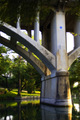
Rebridgedby MelethiaComment by DanSig: [[trading post]]
wow, much nicer than your previous shot, composition is great, lighting is good and even the background is beautiful :)
should have scored higher though, many bad images above yours in the challenge.. |
| Photographer found comment helpful. |
| 06/25/2006 07:22:33 AM |
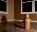
Earth tonesby MelethiaComment by DanSig: [[trading post]]
this is a nice shot, composition is good, could use a wider angle.
the lighting is bad though, the harsh shadows are not helping.
try using a softbox ( white bedsheet ) to soften the light, works great for shots like these.
congrats on your top 25 :) |
| Photographer found comment helpful. |
| 06/25/2006 07:18:37 AM |
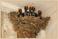
"Crying, Waiting, Hoping"by MelethiaComment by DanSig: [[trading post]]
I'm not a Beatles fan so I don't know this song, but this is a nice image, composition, colors, lighting and postprocessing are all very good.
the nest could use a bit of curves and sharpening, it seems a bit flat.
you'd probably get an 8 from me if I'd voted... |
| Photographer found comment helpful. |
| 06/25/2006 07:15:35 AM |
Public Libraryby MelethiaComment by DanSig: [[trading post]]
this is a very interesting image, composition is nice, the image is quite busy but that's something you can't help, it's the architects fault ;)
all those leading lines are great, too bad they don't lead to anything except those balls in the center...
the colors are good, and so is postprocessing.
I didn't vote on this but would have given it a 7. |
| Photographer found comment helpful. |
| 06/25/2006 01:47:31 AM |
|
| Photographer found comment helpful. |
| 06/24/2006 09:17:01 PM |
|
| Photographer found comment helpful. |
| 06/24/2006 08:41:32 PM |
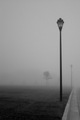
Fog, lightsby MelethiaComment by sarnewfie: the word desolate is a very lonely one, and this photo i think comes pretty darned near, the fog is a perfect touch to give that feeling and the lamp post is very well presented and, in a great angle, i will give this a high score becouse it is pretty close to what i picture desolate to be. |
| Photographer found comment helpful. |
| 06/24/2006 01:44:51 PM |
|
| Photographer found comment helpful. |
| 06/23/2006 07:21:16 AM |
|
| Photographer found comment helpful. |
Home -
Challenges -
Community -
League -
Photos -
Cameras -
Lenses -
Learn -
Help -
Terms of Use -
Privacy -
Top ^
DPChallenge, and website content and design, Copyright © 2001-2026 Challenging Technologies, LLC.
All digital photo copyrights belong to the photographers and may not be used without permission.
Current Server Time: 06/22/2026 02:52:03 AM EDT.