| Image |
Comment |
| 04/05/2007 05:05:17 PM |
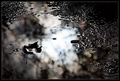
Miniature alleyby MelethiaComment by Louis: Miniaturizing? I've never heard of this before. You use added depth of field to simulate something much smaller than the scene? Wow! It works!! Very cool. |
 Photographer found comment helpful. Photographer found comment helpful. |
| 04/05/2007 03:37:45 PM |
|
| Photographer found comment helpful. |
| 04/05/2007 11:09:50 AM |
|
| Photographer found comment helpful. |
| 04/05/2007 09:02:24 AM |
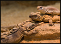
At the mallby MelethiaComment by Jutilda: Your blur shots are awesome. Why this scored so low is beyond me, but you should see my Free Study score. ROFL |
| Photographer found comment helpful. |
| 04/05/2007 08:51:17 AM |
|
| Photographer found comment helpful. |
| 04/05/2007 08:25:27 AM |
|
| Photographer found comment helpful. |
| 04/05/2007 07:57:24 AM |
At the mallby MelethiaComment by Brookied: a good shot but i can see why it did not vote well, i was in the same mind set until i got what DPC voters were after, There is tow ways to go, Take a picture that will be DPC friendly for that i went to past challenges and studied for about two weeks.
Take shots you alone are happy with and stuff the score. As i am in the WPL5 league my shots on here will be friendly, anything else is for me alone.
|
| Photographer found comment helpful. |
| 04/04/2007 10:55:26 PM |
|
| Photographer found comment helpful. |
| 04/04/2007 08:06:07 PM |
|
| Photographer found comment helpful. |
| 04/04/2007 05:24:35 PM |
|
| Photographer found comment helpful. |
Home -
Challenges -
Community -
League -
Photos -
Cameras -
Lenses -
Learn -
Help -
Terms of Use -
Privacy -
Top ^
DPChallenge, and website content and design, Copyright © 2001-2026 Challenging Technologies, LLC.
All digital photo copyrights belong to the photographers and may not be used without permission.
Current Server Time: 07/26/2026 08:24:55 AM EDT.