| Image |
Comment |
| 06/14/2006 01:14:40 AM |
|
 Photographer found comment helpful. Photographer found comment helpful. |
| 06/13/2006 07:59:09 AM |
|
| Photographer found comment helpful. |
| 06/13/2006 07:55:47 AM |
|
| Photographer found comment helpful. |
| 06/13/2006 07:52:44 AM |
|
| Photographer found comment helpful. |
| 06/13/2006 03:42:22 AM |
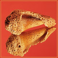
Naturally Textured - Take IIby DigiFotoBuddyComment by Mambe: From the Critique Club :
Hi Shailesh ,
Comparing with  , I think that Naturally Textured - Take II fits much better a Textures' challenge.
The focus is great on the shell and on its reflection , really much better ; the details are very sharp.
Personally I prefer the first background , it's more neutral , maybe even less appealling at a first sight but orange/redish and sand color don't work too well together (imho).
Noise is visible too in this version and about the border , I have noticed that many voters/viewers generally don't appreciate borders.
Lighting is good , better than in the first one (no strong shadows , more natural look).
I agree with Neuferland you truly have improved your shot !
Please feel free to email me about this critique.
Mambe |
| Photographer found comment helpful. |
| 06/12/2006 06:33:20 PM |
Naturally Textured - Take IIby DigiFotoBuddyComment by Neuferland: Shail!!!! Nice! Very nice! HUGE improvement over the original. Focused on one shell, not three, better color, nice pop to the shot. Only two little things bother me, the shell looks a tad oversharpened and the orange background. I would have stuck with black but that's me. I would have given the original a 5, but this one gets an 8 for overall improvement and effort! ;) |
| Photographer found comment helpful. |
| 06/12/2006 03:23:38 AM |
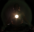
Enlighteningby DigiFotoBuddyComment by yanko: Greetings from CTP2
Cool concept although for me the execution didn't quite make it. I really think you needed a much stronger backlight to make your subject glow around the edges kinda like how the hair is but all over. That would give your subject more presence in the frame as well as give a stronger impression that she is radiating with enlightenment beyond just the flare. However, after reading your setup I'm not sure how you would accomplish that while keeping the spot light you capture in the shot that small.
Really the only issue for me is the subject is just too dark. I think you need to go either full blown silhouette in which case you need more contrast from the background or show more features on the subject using a fill light of some sort. |
| Photographer found comment helpful. |
| 06/12/2006 03:11:51 AM |
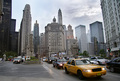
City Architectureby DigiFotoBuddyComment by yanko: Greetings from CTP2
I like the focal points in this image. I also like how the traffic flow leads you into the image.
As far as the challenge theme is concern, I think people get a bit too literal with that. To me this shot is about the "city" which may not be a 100% about the architecture but the city scene you captured tells me a lot about why these buildings exist. A shot of just one skyscraper would tell me just the who and the what but this photo also tells me the why. So for me this fits the challenge theme perfectly.
In terms of improvements, I'm not sure I have any for this image. It looks really good as is. However, if this was my image I think I'd probably mess around with the channel mixer and gradient map to get more contrast in the sky but I doubt I'd produce a better result than what you already have. |
| Photographer found comment helpful. |
| 06/10/2006 12:16:57 AM |
|
| Photographer found comment helpful. |
| 06/09/2006 06:13:31 PM |
Enlighteningby DigiFotoBuddyComment by mpeters: Hi from the Critique Club.
Please feel free to PM me with any comments or questions.
First impression: What is it? A second look reveals the outline of a person but still leaves me wondering about the bright light in the center of the frame.
Technicals: Hard for me to comment without your comments, but after reading them i would have to agree with karma regarding some letting some light spill back onto the models face. As a whole the picture is too dark for my taste but i certainly admire your creativity. A little more light to backlight the top of the models head would have been good to better define the model's shape.
Composition: The square crop with the centered light works well so i feel you made a good choice in that regard.
This is one of those entries where your creative thought process and implementation was lost on a majority of the voters. At least that is my suspicion. Out of the box thinking and you are to be commended. Knowing the details, it is easy to see how it met the challenge but most, myself included, would have probably suspected more than one light source.
I like your stuff and you have had some very nice pics. dont let the end result be discouraging(i'm sure you won't)
Keep shooting,
mark
|
| Photographer found comment helpful. |
Home -
Challenges -
Community -
League -
Photos -
Cameras -
Lenses -
Learn -
Help -
Terms of Use -
Privacy -
Top ^
DPChallenge, and website content and design, Copyright © 2001-2026 Challenging Technologies, LLC.
All digital photo copyrights belong to the photographers and may not be used without permission.
Current Server Time: 07/19/2026 10:03:53 AM EDT.