| Image |
Comment |
| 06/15/2006 08:12:47 PM |
|
 Photographer found comment helpful. Photographer found comment helpful. |
| 06/15/2006 05:13:25 PM |
|
| Photographer found comment helpful. |
| 06/15/2006 10:24:44 AM |
Naturally Textured - Take IIby DigiFotoBuddyComment by Gunnsi: CTP2 Gunnsi
First impression:
Good texture, good focus and frame. Placement of subject also good.
What can you do better?
Change the red colour to something more like the sea.
This is a major improvement on your previous entry. |
| Photographer found comment helpful. |
| 06/15/2006 10:19:20 AM |
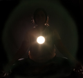
Enlighteningby DigiFotoBuddyComment by Gunnsi: CTP2 Gunnsi
First impression:
To bright light and to dark head.
What can you do better?
decrease the light in the front and increase the light on the head from the back making a better shilouette. |
| Photographer found comment helpful. |
| 06/15/2006 10:16:39 AM |
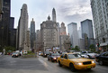
City Architectureby DigiFotoBuddyComment by Gunnsi: CTP2 Gunnsi
First impression:
Citylife, nice and clear photo.
What can you do better?
You did the same mistake that I did in this challenge. Picture of many houses, this is something the voters didn't like.
Only improvement is to select one architecture next time. :-)
This picture is very good but for another challenge.
|
| Photographer found comment helpful. |
| 06/14/2006 06:58:53 PM |
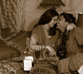
Indulge into happinessby DigiFotoBuddyComment by Gunnsi: Go easy on the wine (and your spouse) :-)
Good placement on your heads and bottle. Bottle also wery clean and in good focus, would have preferred to se the other side on it.
Lovely smiles that show how much fun you are having. The only thing that is distracting is the lamp behind in the right.
Overall a very good picture but I always (almost) prefer colour over bw.
P.S. is she saying: Is this the last take? and you are about to say, I hope so :-) |
| Photographer found comment helpful. |
| 06/14/2006 10:13:46 AM |
Bit Shyby DigiFotoBuddyComment by Jutilda: This one isn't quite as focused as the girl. Nice use of negative space. I'm sure getting a boy to hold still is virtually impossible. LOL |
| Photographer found comment helpful. |
| 06/14/2006 10:13:11 AM |
Duotone studyby DigiFotoBuddyComment by Jutilda: This one is very nice too. Great lighting and focus. If I were to nitpick anything, I'd say the bright contrast of the design on her blouse hurts it a bit, but man, her face is perfect. |
| Photographer found comment helpful. |
| 06/14/2006 10:12:28 AM |
|
| Photographer found comment helpful. |
| 06/14/2006 07:22:05 AM |
|
| Photographer found comment helpful. |
Home -
Challenges -
Community -
League -
Photos -
Cameras -
Lenses -
Learn -
Help -
Terms of Use -
Privacy -
Top ^
DPChallenge, and website content and design, Copyright © 2001-2026 Challenging Technologies, LLC.
All digital photo copyrights belong to the photographers and may not be used without permission.
Current Server Time: 07/19/2026 05:44:54 AM EDT.