| Image |
Comment |
| 06/21/2006 01:14:02 AM |
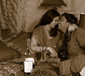
Indulge into happinessby DigiFotoBuddyComment by Rebecca: Hi Shailesh-
I agree with the voters who wanted the color version. Colored fabrics imply a certain richness and luxury that just don't come across in duotone.
Something that might be interesting with a shot like this is more depth of field. Maybe focus just on the wine and grapes and let the models be a background element instead of competing for focus with the wine. Or vice versa - show the couple enjoying their time. There have been a lot of Lensbaby posts lately, this might be an interesting shot to try something like that as well. Good solid concept! |
 Photographer found comment helpful. Photographer found comment helpful. |
| 06/21/2006 01:10:26 AM |
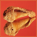
Naturally Textured - Take IIby DigiFotoBuddyComment by Rebecca: Hi Shailesh-
Don't hit me, but I like the original photo much better. I think that red is a very very difficult color to photograph, since it tends to oversaturate very easily, and it overwhelms the natural color variations of the shell. The original looks much cleaner and much sharper, where the retake lacks that nice sharp quality. |
| Photographer found comment helpful. |
| 06/20/2006 10:57:52 PM |
Indulge into happinessby DigiFotoBuddyComment by Gatorguy: I like the image very much. I'm sure you had your reasons for toning it this way, but it looks like it would have been very colorful. The label on the bottle is pretty bright and pulls my eye to it - maybe if it was turned 90 degrees it would have been better. 7 |
| Photographer found comment helpful. |
| 06/20/2006 08:18:22 PM |
Indulge into happinessby DigiFotoBuddyComment by Dr.Confuser: Good concept. Nice setting. Well costumed. Focus is good. Lighting is okay, possibly a little flat. For me though, it might have had a much richer feeling in color rather than the sepia. |
| Photographer found comment helpful. |
| 06/20/2006 06:18:42 AM |
|
| Photographer found comment helpful. |
| 06/19/2006 01:57:10 PM |
Naturally Textured - Take IIby DigiFotoBuddyComment by alexgarcia: Hello from Álex, CTP MkII
First Impression: wonderful texture
Composition: very nice simmetry
Subject: quite interesting shell
Technical: good focus, nice lighting (maybe a little dark on the upper left of the shell.
Improvement: the BG in red is a bit too strong, I prefer the black one
Summary: very good shot. It seems clear you move very well on the studio environment
Álex
|
| Photographer found comment helpful. |
| 06/19/2006 01:48:17 PM |
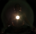
Enlighteningby DigiFotoBuddyComment by alexgarcia: Hello from Álex, CTP MkII
First Impression: very clever idea but IMO the realization could be improved
Composition: good, in this case the centered composition works well
Subject: very good concept for the challenge, with an original idea
Technical: the main flaw IMO is technical. If you had achieved a good silhouette, this shoot will deserved a very high score.
Improvement: a better lighting to make the silhouette more perfect
Summary: very intelligent idea.
Álex
|
| Photographer found comment helpful. |
| 06/19/2006 01:11:31 PM |
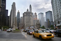
City Architectureby DigiFotoBuddyComment by alexgarcia: Hello from Álex, CTP MkII
First Impression: wonderful wide shot
Composition: good, like it
Subject: OK for me, but probably too wide for some people on this challenge. By wide I mean that some people, for comments I've seen in others shots, including mine was expecting more shots on details. But I think this shot is perfect for the challenge.
Technical: very good: great DOF, with everything in focus, very natural colors.
Improvement: I'm not sure if correcting the deformation in the perspective of the lateral buildings would help or not, just an idea...
Summary: Well done, maybe chicago deserves a visit...
Álex
|
| Photographer found comment helpful. |
| 06/19/2006 04:32:54 AM |
Enlighteningby DigiFotoBuddyComment by blackenedwhite: CPTII
Actually, the shot looks better the longer you stare at it.
It was a great idea, albeit not very obvious e.g. the low DNMC scores.
The subject was, honestly, still a bit too dark. A 30-second expsure with a 1-second exposure for the light would've looked better, I think.
Just a suggestion, though. |
| Photographer found comment helpful. |
| 06/19/2006 04:22:10 AM |
City Architectureby DigiFotoBuddyComment by blackenedwhite: CPTII, oi!
Dude, this one's more of a cityscape than an architecture entry.
That isn't to say that it doesn't meet the challenge, though. Actually, it does. Quite deviated from the norm, however.
I quite like the buildings in the BG (OMG the subjects's the BG hehe) and the general feel of the whole thing borders on melancholia.
Nice work, Shailesh. |
| Photographer found comment helpful. |
Home -
Challenges -
Community -
League -
Photos -
Cameras -
Lenses -
Learn -
Help -
Terms of Use -
Privacy -
Top ^
DPChallenge, and website content and design, Copyright © 2001-2026 Challenging Technologies, LLC.
All digital photo copyrights belong to the photographers and may not be used without permission.
Current Server Time: 07/21/2026 04:16:15 PM EDT.