Craftsmanshipby
AzrifelComment by SharQ: Critique Club
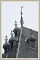
The first thing that I noticed about this picture was the borders. They made me cringe violently for about 60 seconds. I must honestly say that I don't particularly like border to begin with, but well. if you HAVE to use borders, I would suggest using a very thin black or white border (1 pixel, perhaps?) around the picture before adding coloured borders.
When that whining is over width, I have to say I like your image. The crop on the left side leaves something to be desired, I feel, but overall the image is very good. Nice contrast, good sharpness and interesting composition. The thingies on the window overhangs are very dtailed, and they make me kind of lose focus: I would think that the intention would be to pull the attention to the "wimpeltje" (whatever that is called in English) on the spire.
I think, with the photo subject chosen, you could not have done a lot better. When that is said, I think I should probably say that I think you could have found more interesting subjects in that village.
Personally, I gave you a 5, because I couldn't quite make up my mind if I liked the image or not. strangely enough, I didn't know why then, and I don't really know why now. I'm sorry
Haje