| Image |
Comment |
| 10/14/2005 01:32:05 PM |
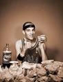
The Burger Masterby Rook3000Comment by RKT: Oh s* %t...10...truly marvelous...OMG... truly truly marvelous.
...part two: If this does not win...I think I'll be sick... |
 Photographer found comment helpful. Photographer found comment helpful. |
| 10/14/2005 10:20:58 AM |
The Burger Masterby Rook3000Comment by cmeier: the guy's expression is spot-on! truly, this photo makes me laugh out loud -- a great interpretation of 'pride'! |
| Photographer found comment helpful. |
| 10/13/2005 04:48:44 PM |
The Burger Masterby Rook3000Comment by holyfam: finally some pride, great lighting, composition and a little homurous, you helped go further thru the junk submitted, thanks |
| Photographer found comment helpful. |
| 10/12/2005 09:13:19 PM |
|
| Photographer found comment helpful. |
| 10/12/2005 04:41:42 PM |
|
| Photographer found comment helpful. |
| 10/12/2005 12:23:44 PM |
|
| Photographer found comment helpful. |
| 10/12/2005 09:12:38 AM |
The Burger Masterby Rook3000Comment by Jutilda: This is hilarious. I love that he's advertising not only Coke and Nike, but the Chicago bulls and the burger joint from where they came. LOL The sepia filter is terrific. The composition is good, although I wish the guy weren't so centered. Thanks for the chuckle. 8 |
| Photographer found comment helpful. |
| 10/12/2005 01:24:56 AM |
|
| Photographer found comment helpful. |
| 09/16/2005 12:56:48 PM |
Fear & Loathing in NashVegasby Rook3000Comment by SJCarter: I especially like this shot, as I used to live in NashVegas! :-) Cool effect and I like the movement of the hands. The movement of the head is a little distracting though - or maybe that's an optical illusion from the light cast by the match on the sunglasses. I like the crop, but the background being blown out is also a distraction. Still, like I said, I love the shot for sentimental reasons! Wish I was back there - and maybe again soon! |
| Photographer found comment helpful. |
| 07/26/2005 12:57:15 PM |
Red and Yellow Hydrantby Rook3000Comment by cpanaioti: Composition: Overall good placement though maybe a little too close or the crop slightly too tight on the left. 6
Exposure: Though the colours look true to life and the texture is quite visible in the peeling paint I feel the lighting is a bit flat. More lighting across the subject would help emphasize the texture but also give life to the subject. 5
Impact: Neutral. In addition to the lack of light I feel the impact is lost with the shallow DOF. The bottom 1/3 of the image is out of focus and I feel this takes away from the image. 5
Overall: 5 |
| Photographer found comment helpful. |
Home -
Challenges -
Community -
League -
Photos -
Cameras -
Lenses -
Learn -
Help -
Terms of Use -
Privacy -
Top ^
DPChallenge, and website content and design, Copyright © 2001-2026 Challenging Technologies, LLC.
All digital photo copyrights belong to the photographers and may not be used without permission.
Current Server Time: 07/16/2026 08:17:29 PM EDT.