| Image |
Comment |
| 07/07/2021 12:04:17 AM |
|
 Photographer found comment helpful. Photographer found comment helpful. |
| 07/06/2021 12:14:05 PM |
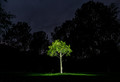
Little oneby LevTComment by LevT: Originally posted by vawendy:
Hey Lev -- I'm interested in what size flashlight and a little more details on how you did it. I've tried light painting before, but everything was really dim. |
Just a regular small LED flashlight. The trick is that I used Live Composite mode that as far as I know is only available in Olympus mirrorless cameras. It allows me to keep painting until I am happy with the result (I can see the progress on the camera's back screen or on my phone if I connect it wirelessly) while the background stays exactly the same and does not get any brighter. Very convenient mode for light painting. I just used it for fireworks, also piece of cake. |
| 07/05/2021 08:55:52 PM |
Little oneby LevTComment by vawendy: Hey Lev -- I'm interested in what size flashlight and a little more details on how you did it. I've tried light painting before, but everything was really dim. |
| Photographer found comment helpful. |
| 07/05/2021 05:45:19 AM |
|
| Photographer found comment helpful. |
| 07/05/2021 01:04:16 AM |
|
| Photographer found comment helpful. |
| 07/03/2021 09:16:06 PM |
Sharp Leftby LevTComment by tate: I'm feeling an imbalance. Too much from the bottom of the scene. |
| Photographer found comment helpful. |
| 07/01/2021 08:36:13 PM |
Angel Moroniby LevTComment by Bear_Music: Can you get any closer, Lev? (I photographed that temple for the Saints before they sanctified it). |
| Photographer found comment helpful. |
| 06/28/2021 03:10:29 PM |
|
| Photographer found comment helpful. |
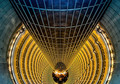
| 06/28/2021 01:50:31 PM |
Pierception by LevTComment by GeneralE: Well-done -- I would not have recognized this as a composite without your welcome explanation.
To me it looks like the view from the top of a bizarre water-slide. :-) |
| Photographer found comment helpful. |
| 06/26/2021 03:03:49 PM |
|
| Photographer found comment helpful. |
Home -
Challenges -
Community -
League -
Photos -
Cameras -
Lenses -
Learn -
Help -
Terms of Use -
Privacy -
Top ^
DPChallenge, and website content and design, Copyright © 2001-2026 Challenging Technologies, LLC.
All digital photo copyrights belong to the photographers and may not be used without permission.
Current Server Time: 06/23/2026 10:08:45 AM EDT.