| Image |
Comment |
| 09/13/2005 01:11:57 AM |
|
 Photographer found comment helpful. Photographer found comment helpful. |
| 09/12/2005 01:38:55 AM |
|
| Photographer found comment helpful. |
| 09/11/2005 12:52:25 AM |
Contrastby sigrun_thComment by Tammer: While there are highlights, overall there are many areas which are very similar in tonal value. Also, the photo doesn't have that "wow" factor of other entries in the challenge. I do like how your subject matter is off-centered though. |
| Photographer found comment helpful. |
| 09/10/2005 10:02:18 AM |
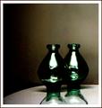
Contrastby sigrun_thComment by LucidLotus: Definite contrast. I like the composition in the respects of how the image is laid out. I'm not too keen on the lighting, the glare on the vases is too stark for me - though I suppose it does match the high grain of the image. That said I'm not enthralled with the use of grain in this case either - I'm not against grain in general, it just doesn't seem to serve a purpose in this image. I cannot see what vision you are trying to bring across with its use so it seems out of place in my mind. What I do enjoy is that swathe of light/reflection? across the bottom of both vases below the annoying bar of light. The swathe on the vase closes looks almost like a dancer leaping into the air, I think that abstract flowing look adds a nice interest touch. I gave a 5. |
| Photographer found comment helpful. |
| 09/10/2005 05:07:51 AM |
|
| Photographer found comment helpful. |
| 09/10/2005 04:51:46 AM |
Graceby sigrun_thComment by Caine: The glare from the distracting objects bottom left is the biggest issue I see here, and a slightly different viewpoint would have solved this. |
| Photographer found comment helpful. |
| 09/09/2005 11:51:47 PM |
|
| Photographer found comment helpful. |
| 09/09/2005 11:27:36 PM |
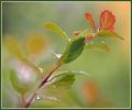
Graceby sigrun_thComment by SJCarter: Wow - absolutely beautiful. Fantastic focus & DOF. Gorgeous tones. My only slight criticism is the border (and it's not bad, I just don't think it adds to the image). Great job. |
| Photographer found comment helpful. |
| 09/08/2005 09:39:50 PM |
|
| Photographer found comment helpful. |
| 09/08/2005 09:04:41 PM |
|
| Photographer found comment helpful. |
Home -
Challenges -
Community -
League -
Photos -
Cameras -
Lenses -
Learn -
Help -
Terms of Use -
Privacy -
Top ^
DPChallenge, and website content and design, Copyright © 2001-2026 Challenging Technologies, LLC.
All digital photo copyrights belong to the photographers and may not be used without permission.
Current Server Time: 06/21/2026 03:03:11 PM EDT.