| Image |
Comment |
| 05/06/2007 02:54:27 PM |
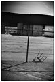
four.by xantangummiComment by violinist123: Purposefully tilted? Not my cup of tea. Burning in the upper right is a bit heavy compared to the other corners. The entire image gives me a sense of imbalance - intended? Could be. |
 Photographer found comment helpful. Photographer found comment helpful. |
| 05/06/2007 02:53:21 PM |
|
| Photographer found comment helpful. |
| 05/05/2007 10:03:30 PM |
one.by xantangummiComment by J-Me: In a regular challenge, I can only hear the comments about the over exposure and "blow outs" *grin* BUT......we're here, learning to express ourselves and some of the great shots in advertising have been purposely over exposed and blown out to highlight certain focal points. Love them both actually! |
| Photographer found comment helpful. |
| 05/03/2007 09:33:11 PM |
|
| Photographer found comment helpful. |
| 05/03/2007 10:53:08 AM |
one.by xantangummiComment by TDCollins: The left is my favorite. The angle of the shot gives longer lines on her face which adds to capture her beauty. Very nice! |
| Photographer found comment helpful. |
| 05/03/2007 09:49:21 AM |
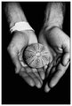
two.by xantangummiComment by littlegett: I am looking at this and there are three elements that totally distract me, one the wrist band, it cuts off the hand and drawls the eye to something uninteresting, two, the off centered object in the hands, makes me wonder why cup it in two hands if its only in one? Last the cropping of the hand on my right (hand left)just cut a bit off and it really makes me wonder if this was taken on the fly, or set up? |
| Photographer found comment helpful. |
| 05/02/2007 05:07:41 PM |
two.by xantangummiComment by colorcarnival: lol the armband is strange, I like the noise because it balances with the varied pattern of the shell? ball? thing in your hands? Not sure if I like the hand cropped - would not know till I saw a different pic. I think it is an interesting composition. |
| Photographer found comment helpful. |
| 05/02/2007 11:32:19 AM |
two.by xantangummiComment by CapeSail: I like the lighting. The composition is nice. I find the arm band distracting. I think the noise makes the photo appear old. |
| Photographer found comment helpful. |
| 05/02/2007 08:16:55 AM |
one.by xantangummiComment by CNovack: I don't think the one on the left is over contrasty - on my monitor the B&W tones really pop visually. Normally I like to see portraits that show the eyes, but the one on the left shows personality - the tilt to the head and the impression of giving the viewer a slight stare-down behind those sunglasses gives me the idea of a spunky and very opinionated lady. "Showing" or capturing some personality in a shot is good because it serves to draw a viewer in and hold their interest. The one on the right has good B&W tones but is not in as sharp focus as the left one. The top halve of the face is in focus with sharp details but the lower half seems a tad soft. |
| Photographer found comment helpful. |
| 05/02/2007 08:09:31 AM |
one.by xantangummiComment by noraneko: Very cool. Like your choice of slight overexposure here - I don't find it too "contrasty". However, the tones don't quite match in the two photos - the right has a slight blue undertone, and the left has a red undertone. Not sure if it was deliberate. If so, I would either emphasize the difference more or try to match them up a bit more. Anyway, excellent submission! |
| Photographer found comment helpful. |
Home -
Challenges -
Community -
League -
Photos -
Cameras -
Lenses -
Learn -
Help -
Terms of Use -
Privacy -
Top ^
DPChallenge, and website content and design, Copyright © 2001-2026 Challenging Technologies, LLC.
All digital photo copyrights belong to the photographers and may not be used without permission.
Current Server Time: 07/16/2026 09:00:19 AM EDT.