| Author | Thread |
|
|
05/07/2007 04:49:58 PM |
|
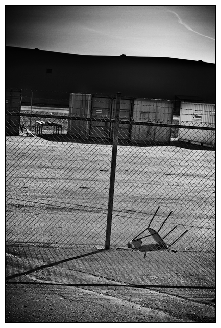
I think the vignette works very well on the bottom, gives it a grungy look. But on the top, it seems out of place. Probably because there is not texture up top, just sky. I love the shot though. Just a very real, place with nothing special, but something interesting. |
|
 Photographer found comment helpful. Photographer found comment helpful. |
|
|
05/06/2007 11:52:42 PM |
|
Tilt gives only a small head twister. Enjoy the mystery of the place. Fence & shadow w/abandoned chair. I could possibly see it presented without the sky. |
|
| Photographer found comment helpful. |
|
|
05/06/2007 04:20:21 PM |
|
i like the slight tilt goes really well with this composition with the upside chair. i like the gradient of dark to light in the sky. |
|
| Photographer found comment helpful. |
|
|
05/06/2007 03:03:04 PM |
|
I kinda like the imbalance. By the way, a square crop with just the fence, the shadows, and the chair is kinda cool too. |
|
| Photographer found comment helpful. |
|
|
05/06/2007 02:54:27 PM |
|
Purposefully tilted? Not my cup of tea. Burning in the upper right is a bit heavy compared to the other corners. The entire image gives me a sense of imbalance - intended? Could be. |
|
| Photographer found comment helpful. |
Home -
Challenges -
Community -
League -
Photos -
Cameras -
Lenses -
Learn -
Help -
Terms of Use -
Privacy -
Top ^
DPChallenge, and website content and design, Copyright © 2001-2026 Challenging Technologies, LLC.
All digital photo copyrights belong to the photographers and may not be used without permission.
Current Server Time: 07/23/2026 01:33:57 AM EDT.