| Image |
Comment |
| 05/02/2005 12:44:34 AM |
tiffanyby gtp1164Comment by zagman: Thank you for submitting your photo to the People II DPChallenge.
Great job capturing your young subject. She looks very comfortable posing and appears mature beyond her age. It also looks like she has pose for photos before. She looks calm and confident.
The soft effect works in a limited way. There is too much softness in the facial area. Her left eye has too much soft process done. So it creates an immediate distraction. It also gives the image an uneven appearance. The shirt area has little or no soft effect applied. There is also some "pixelization" on the upper right corner as well as in the lower left corner of the frame. Also sometimes when you crop a photo closeup, you can see the photographer image in the subjects eyes, as in this case. This can be avoided by using a tripod and zooming in from a longer distance.
Overall a very nice photo of a young lady in her early childhood. Its a permanent familial keeper.
Good luck in your future DPChallenges.
Overall a great shot of a young lady. Less softness and watch those "orphan pixels". |
| 05/01/2005 11:24:19 PM |
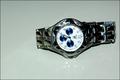
on sale 1,000by gtp1164Comment by wetland: The reflections take away from what otherwise might be a good shot. Also, watch ads are almost always shot with the hands at 10 and 2. |
| 05/01/2005 11:31:48 AM |
on sale 1,000by gtp1164Comment by NathanWert: Nice watch. I think it might have worked a little better if the watch was flipped though. With the set knob facing up. Also, the background gives it an "off" coloring. |
| 05/01/2005 12:08:13 AM |
on sale 1,000by gtp1164Comment by RedOak: Lighting is harsh and uncontroled, reflection is quite weak and doesn't seem planned. Time displayed is not flattering for the watch make. Composition is boring. no background doesn't help. Keep at it. 4 |
| 04/30/2005 07:49:45 PM |
|
| 04/30/2005 07:38:07 PM |
|
| 04/30/2005 02:41:37 PM |
|
| 04/30/2005 12:36:01 PM |
on sale 1,000by gtp1164Comment by banmorn: Plain and simpe, good detail on the watch. not the best choice for background, the faint reflections distract rather than enhance the subect. Think the composition could be better as well. |
| 04/29/2005 06:39:06 PM |
on sale 1,000by gtp1164Comment by graphicfunk: The lighting is a little shy giving way to some loss of detail. When placed on a reflective surface your lighting task mounts in difficulty. The composition is nice and hence the bump. |
| 04/29/2005 03:03:03 PM |
on sale 1,000by gtp1164Comment by woohoopepper: I like the reflection, but it might have been more captivating on pure white (I think it just is giving off a greyish cast). Also a little closer in to the watch might have added to clarity. |
Home -
Challenges -
Community -
League -
Photos -
Cameras -
Lenses -
Learn -
Help -
Terms of Use -
Privacy -
Top ^
DPChallenge, and website content and design, Copyright © 2001-2026 Challenging Technologies, LLC.
All digital photo copyrights belong to the photographers and may not be used without permission.
Current Server Time: 07/17/2026 07:31:53 AM EDT.