| Image |
Comment |
| 05/14/2006 10:22:23 PM |
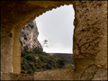
Lonely treeby alexgarciaComment by blackenedwhite: From the CTP MkII
First Impression: It's an average photo... it doesn't have much to offer, IMO. Sorry. 4 or 5.
Composition: Your comp on this photo is what keeps it standing however the other departments get tanked. 5 or 6.
Subject: When you said lonely tree, I'd've expected more tree and less not tree. 4 or 5.
Technical: DOF's a bit too shallow, and shot's a bit underexposed. 5.
Summary: Okay, this ain't one of your best photos. T least the ones that followed it did good, right?
Disclaimer: The following crits are personal opinions, not photographic dogmas. Please see them as suggestions, not claims of mastery nor a show of hauteur.;p
|
 Photographer found comment helpful. Photographer found comment helpful. |
| 05/14/2006 10:13:48 PM |
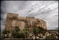
982 years oldby alexgarciaComment by blackenedwhite: From the CTP MkII
First Impression:
Nice. The photo pretty much speaks for itself... doesn't need a title although it does get strengthened by it. 7.
Composition: Isn't it a bit tilted? Anyways, off-center works. But I'm left wondering... wouldn't it have worked better had it a vertical composition and about 50% skyspace? Just musing... 6 or 7.
Subject: It's a great subject and it DOES meet the challenge. An 8 or 9 from me.
Technical: I guess it's properly exposed... if not a bit on the dark side. Personally, I'd give it more contrast, but I guess it's fine as it is. 6.
Summary: A top-notch photo, IMO, with a potential for greatness -- with proper tweaking. Congrats on the top 25.
Disclaimer: The following crits are personal opinions, not photographic dogmas. Please see them as suggestions, not claims of mastery nor a show of hauteur.;p
|
| Photographer found comment helpful. |
| 05/14/2006 03:59:33 PM |
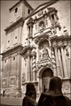
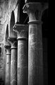
St. James arriving to the templeby alexgarciaComment by livitup: Good choice for conversion to black and white. I would have either lit the statues in the foreground a little more so that you could make out the details in them, or moved forward to exclude them from the photo. As it is composed now they're a little distracting. |
| Photographer found comment helpful. |
| 05/14/2006 02:16:04 PM |
|
| Photographer found comment helpful. |
| 05/14/2006 01:05:27 AM |
|
| Photographer found comment helpful. |
| 05/14/2006 12:46:25 AM |
You can't judge a book by its coverby alexgarciaComment by DigiFotoBuddy: Greetings from your own critique club.
First Impression
Very Nice shot, with WOW factor.
Composition:
Very nice composition with tight corp.
Subject:
I really like the subject. Nice take on the challenge.
Technical (Colour and light):
The color and lighting is perfect.
Improvement:
Only one thing I don't like here - the blur effect is the front. It's definately very good DOF, but just wonderning how it would look with focus is front too.
Summary:
Very nice picture, creative, funny, perfect for the challenge.
Very nice image. Congrates on your 12th finish and Personal Best. Keep'em coming. |
| Photographer found comment helpful. |
| 05/12/2006 09:00:09 AM |
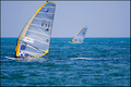
E-71 wins again the World Championship of Windsurfby alexgarciaComment by timfythetoo: Greetings from the Critique Club -
I like many aspects of this shot. The front board is in great focus along with the water trail behind him. The details on the sail are sharp. I like the soft focus on the back board - it is a good compliment. The colors work well also.
I think the only thing that needs adjustment is the crop. I would have liked to have seen a little bit more to the left and top of the front boat and/or a little less on the bottom. It just feels a bit tight on the top and left. The extra space may have given an even better sense of the vast ocean expanse (if that makes any sense).
Beyond that I think this shot works very well. I could see this shot in the sports section of a paper or magazine. Great capture.
Tim |
| Photographer found comment helpful. |
| 05/12/2006 12:55:58 AM |
You can't judge a book by its coverby alexgarciaComment by margiemu: Nice, clean shot. Fits the cliche perfectly. The Mickey Mouse is subtle, and funny. Well lit, and focused, except for the hands. I would have liked to seem them a little sharper.
Over all great shot!! |
| Photographer found comment helpful. |
| 05/11/2006 12:35:21 PM |
|
| Photographer found comment helpful. |
| 05/11/2006 11:50:58 AM |
|
| Photographer found comment helpful. |
Home -
Challenges -
Community -
League -
Photos -
Cameras -
Lenses -
Learn -
Help -
Terms of Use -
Privacy -
Top ^
DPChallenge, and website content and design, Copyright © 2001-2026 Challenging Technologies, LLC.
All digital photo copyrights belong to the photographers and may not be used without permission.
Current Server Time: 06/22/2026 04:32:21 PM EDT.