| Author | Thread |
|
|
06/16/2006 01:40:30 PM |
Greetings from your own critique club.
First Impression
Nice shot.
Composition:
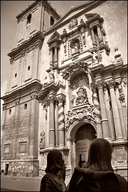
Nice angle shot. I don't know if it was possible to include more of the statues.
Subject:
Very nice, fits the challenge
Technical (Colour and light):
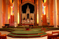
I reallt like the duotone effect and lighting is perfect.
Improvement:
If it was possible to show more of the statues.
Summary:
Nice over picture meeting the challange.
Keep shooting. |
|
 Photographer found comment helpful. Photographer found comment helpful. |
|
|
05/29/2006 12:23:34 AM |
CPT MkII, clocking in.
Not very familiar with religious establishments but if I see correctly, you wish to give the impression that the two statues, had they not been inanimate, have travelled faaaaaar and away and have arrived at this particular edifice, is that about right?
LOL, if it is. Droll humour, yeah. The lighting's a bit flat, though, innit? Also, the whole thing lacks punch. A different angle, perhaps, or recomposition? Whatever man, it's an okay photo all in all. |
|
| Photographer found comment helpful. |
|
|
05/25/2006 01:42:07 PM |
From CTP2 Gunnsi
First impression: Beautiful church, somebody standing in the way of it and what is that building in the left?
What is good?
1. Focus, contrast and light are all good.
What can be better?
1. I am not sure it was a good choice to make it B/W, I miss the blue sky.
2. Maybe skip a bit of the left of the church and trying to have the statues a bit higher and more to the right.
3. Use fill flash on the statues. |
|
| Photographer found comment helpful. |
|
|
05/18/2006 10:33:24 PM |
Hi Alex!
This looks like a beautiful old church (basilica?)! No one does it quite like the Europeans, I think. Excellent choice of subject here. I like the aged b/w treatment.
There are some blown highlights on the face of the building and I think it's a diffuser or a polarizer that would help with that? I honestly don't remember which since I don't own that sort of equipment at this point. I wish I could see the top of the temple or, as an alternative, see a tighter crop with less height - at least then it would look like a more deliberate choice, less like you just ran out of camera space. In the lower left there's a darker gray strip of road or sidewalk that is a little distracting, I don't think anything would be lost by cropping it out. |
|
| Photographer found comment helpful. |
|
|
05/17/2006 09:27:03 PM |
From CTP2:
I commented during the challenge, but I'll look a little closer Ü.
I like the duotone effect in this. It works well. The subject you picked is good - lots of interest. The statues at the front are sort of growing on me, but maybe if you would have included just a tad more of them, so they didn't look so cut off? And somehow lit them a little more so they weren't quite as dark? I like what you were trying to do, though, and they do give the photo some perspective.
Overall a nice shot. |
|
| Photographer found comment helpful. |
|
|
05/17/2006 04:05:57 PM |
Greetings from CTP2
Good choice on color treatment. Composition-wise, I like how you included foreground and background elements which gives the image depth and interest. I'm not sure I like the perspective of the building but I'm not really sure how you could fix that within this particular composition (with the statues) or using basic editing.
Btw, I do like the statues in there and they are level so it equalizes the building tilt somewhat. Other than that I like the photo. The color and detail is pleasing. The statues themselves add some contrast and a focal point that leads you up the image.
Message edited by author 2006-05-17 16:07:59. |
|
| Photographer found comment helpful. |
|
|
05/17/2006 02:40:19 PM |
I like the way the statues look alive!! Not so sure on the angel. I keep turning my head to see it straigh LOL!!
But it is very nice:) |
|
| Photographer found comment helpful. |
Comments Made During the Challenge  |
|
|
05/16/2006 07:29:39 PM |
|
very nice image, it really looks like the statues are real people, until one looks closer. |
|
| Photographer found comment helpful. |
|
|
05/16/2006 02:45:26 PM |
|
| Photographer found comment helpful. |
|
|
05/15/2006 09:02:58 PM |
|
| Photographer found comment helpful. |
|
|
05/14/2006 03:59:33 PM |
|
Good choice for conversion to black and white. I would have either lit the statues in the foreground a little more so that you could make out the details in them, or moved forward to exclude them from the photo. As it is composed now they're a little distracting. |
|
| Photographer found comment helpful. |
|
|
05/14/2006 02:16:04 PM |
|
| Photographer found comment helpful. |
|
|
05/11/2006 11:50:58 AM |
|
Interetsing, not sure if I like the inclusion of the statues or not. Needs to be rotated right just a bit. |
|
| Photographer found comment helpful. |
|
|
05/10/2006 07:52:09 PM |
|
The figures in the forground are sort of disctracting imho. I really like the intricate stone work over the door. |
|
| Photographer found comment helpful. |
Home -
Challenges -
Community -
League -
Photos -
Cameras -
Lenses -
Learn -
Help -
Terms of Use -
Privacy -
Top ^
DPChallenge, and website content and design, Copyright © 2001-2026 Challenging Technologies, LLC.
All digital photo copyrights belong to the photographers and may not be used without permission.
Current Server Time: 06/30/2026 05:32:22 PM EDT.