| Image |
Comment |
| 07/08/2006 09:52:52 AM |
|
 Photographer found comment helpful. Photographer found comment helpful. |
| 07/05/2006 10:14:32 AM |
|
| Photographer found comment helpful. |
| 06/28/2006 04:53:14 AM |
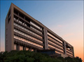
Dawnby alexgarciaComment by Oddfrog: Hi!
I'm sure I commented on this one, must have forgotten:)
I like the angle of the building, it gives it a dream like appearance along with the colours of the sky.
I like the way the sky reflects off the windows. Nice touch! Not to sure about the trees... |
| Photographer found comment helpful. |
| 06/28/2006 04:50:38 AM |
Here comes the sunby alexgarciaComment by Oddfrog: Hi!
the colours are nice here especially the water. Nice rule of thirds. The only thing that bothers me is the tractor in the foreground. That dark spot takes the attention away from the sun. |
| Photographer found comment helpful. |
| 06/28/2006 04:48:11 AM |
Beauty between greenby alexgarciaComment by Oddfrog: Hi!
The blurred hedge in front of her face is a bit confusing and the branches in her face are a bit distracting.
The lighting is good and the composition is great:) |
| Photographer found comment helpful. |
| 06/23/2006 03:40:50 AM |
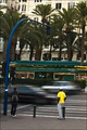
Here comes the sunby alexgarciaComment by yanko: Greetings from CTP2
Striking colors which is what you want to see in a sunset shot. Also good job controlling the highlights. Overall a good job there. The main thing holding this back in my opinion is the cityscape in the background. It's just a bit drabby with no interesting architecture. Also that construction truck isn't helping. Not that you could do much about any of that with this shot. Still a strong image and one that met the challenge pretty well. Message edited by author 2006-06-23 03:41:58. |
| Photographer found comment helpful. |
| 06/23/2006 03:31:31 AM |
Beauty between greenby alexgarciaComment by yanko: Greetings from CTP2
Ok, the two issues I have with this is the out of focus areas and those rouge branches over the face. In the out of focus areas I feel the blur doesn't look good. When I look at that it looks like there are brush strokes probably just the way the blur was rendered but I would blur it more in post just so it was smoother.
The other thing is the two branches over the face. I just wish they weren't there. Other than that I like the image. The composition works great. |
| Photographer found comment helpful. |
| 06/16/2006 01:40:30 PM |
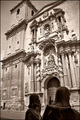
St. James arriving to the templeby alexgarciaComment by DigiFotoBuddy: Greetings from your own critique club.
First Impression
Nice shot.
Composition:
Nice angle shot. I don't know if it was possible to include more of the statues.
Subject:
Very nice, fits the challenge
Technical (Colour and light):
I reallt like the duotone effect and lighting is perfect.
Improvement:
If it was possible to show more of the statues.
Summary:
Nice over picture meeting the challange.
Keep shooting. |
| Photographer found comment helpful. |
| 06/16/2006 01:35:38 PM |
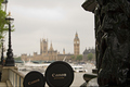
Daddy and son visiting Londonby alexgarciaComment by DigiFotoBuddy: Greetings from your own critique club.
First Impression
Nice shot with very good DOF.
Composition:
Good Composition. The "son" is cut. Don't know if it was possible to keep complete round of both lense caps.
Subject:
It was very tricky challenge. I actually could not think of any idea for this one. So nice take on the challenge.
Technical (Colour and light):
Good DOF and colors. I would prefer more lights on the BG, particularly to bring out the beautiful building.
Improvement:
More lights on the BG and full lense caps.
Summary:
Nice over all shot, and deserves better score than what it got.
Cheers!! Keep shooting. |
| Photographer found comment helpful. |
| 06/16/2006 01:30:35 PM |
Dawnby alexgarciaComment by DigiFotoBuddy: Greetings from your own critique club.
First Impression
Very Nice and sharp shot.
Composition:
Good Composition.
Subject:
Very nice, fits the challenge
Technical (Colour and light):
Colors are very nice. As far as ligting is concern, I don't like dark foreground. I think dodging would have helped to bring out some details. The buildig it self and sky lighting is just perfect.
Improvement:
Details in the front.
Summary:
Very nice picture over all.
Cheers!! Keep shooting. |
| Photographer found comment helpful. |
Home -
Challenges -
Community -
League -
Photos -
Cameras -
Lenses -
Learn -
Help -
Terms of Use -
Privacy -
Top ^
DPChallenge, and website content and design, Copyright © 2001-2026 Challenging Technologies, LLC.
All digital photo copyrights belong to the photographers and may not be used without permission.
Current Server Time: 06/22/2026 04:32:47 PM EDT.