| Image |
Comment |
| 11/24/2004 11:30:04 AM |
Fingertip Authorityby bigfishComment by srdanz: Very nice composition, and good choice for b/w photo. A recommendation: hand holding the pen might have been better here, as that would have reduced the shadow of the pen on the paper |
 Photographer found comment helpful. Photographer found comment helpful. |
| 11/24/2004 12:57:30 AM |
Fingertip Authorityby bigfishComment by KDO: Nice use of light and shadow. Great clean lines in the crisp focus, letters, and pen. I would have angled the pen from the other upper corner so that the signature was not obscured by the shadow from pen. The artist did an excellent job by choosing to make the letters so clear and tight at the bottom of the page and then sliding out of focus as they move up the page. Outstanding choice of angle for that aspect. Great image. |
| Photographer found comment helpful. |
| 11/24/2004 12:29:00 AM |
Fingertip Authorityby bigfishComment by fotodude: wounderful shot.
i lov the grayscale of the whole image everything fits well
1 thing though i am bothared by the sarrifs on the x instead of it looking leagle it kinda seems home done.(should have changed the font for that)
thats all GL,-BC |
| Photographer found comment helpful. |
| 11/18/2004 02:51:59 PM |
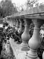
The Secret Gardenby bigfishComment by pcody: The tones are good. Darks, lights and lots of mid-tones. It does look a little soft and I don't know about the tilt. Seems to be disorienting to me, like it's running away or rejecting the viewer when I would want it to be welcoming. |
| Photographer found comment helpful. |
| 11/18/2004 02:15:24 PM |
The Secret Gardenby bigfishComment by nova: This photo really seems to lean to the right. The dark (rose?) leaves on the left distract a bit, also. Nice composition and tonal range. |
| Photographer found comment helpful. |
| 11/17/2004 07:09:04 PM |
The Secret Gardenby bigfishComment by cwalmye: I like the depth of field and the line from the fence. There doesn't seem to be too many shades of gray though.... Nice shot though. |
| Photographer found comment helpful. |
| 11/17/2004 04:29:50 PM |
The Secret Gardenby bigfishComment by jmassung: I do like the contrast, and think the subject has potential. Not sure why, but the photo appears tilted. Definatley busy, and yet the railling draws your eyes back. -5- |
| Photographer found comment helpful. |
| 11/17/2004 04:12:46 PM |
The Secret Gardenby bigfishComment by RatedR: I like the way the rail shoots into the back of the picture, giving it a tremendous sense of depth. But, I don't like the way the rail tilts to the left. Still a good shot. |
| Photographer found comment helpful. |
| 11/17/2004 12:42:51 PM |
|
| Photographer found comment helpful. |
| 11/17/2004 03:54:41 AM |
The Secret Gardenby bigfishComment by fotodude: that damn hawk is in the shot [jk]-LOL
good shot i like it, it works well in B&W - GL with this 1 man its like no other and belive me i've been through all of them by now.-GL |
| Photographer found comment helpful. |
Home -
Challenges -
Community -
League -
Photos -
Cameras -
Lenses -
Learn -
Help -
Terms of Use -
Privacy -
Top ^
DPChallenge, and website content and design, Copyright © 2001-2026 Challenging Technologies, LLC.
All digital photo copyrights belong to the photographers and may not be used without permission.
Current Server Time: 07/16/2026 03:06:10 AM EDT.