| Image |
Comment |
| 08/19/2005 08:14:41 PM |
|
 Photographer found comment helpful. Photographer found comment helpful. |
| 08/19/2005 05:39:23 PM |
|
| Photographer found comment helpful. |
| 08/18/2005 10:01:45 PM |
|
| Photographer found comment helpful. |
| 08/18/2005 07:37:49 PM |
|
| Photographer found comment helpful. |
| 08/18/2005 07:07:02 PM |
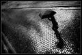
(as seen by) The Sky's Tearsby fotodudeComment by karmat: Artistic but understandable; I like that in a photograph.
The bw gives it a certain mysterious mood, and the lone pedestrian gives the eye something simple to focus on. Great work. |
| Photographer found comment helpful. |
| 08/18/2005 02:13:01 PM |
At the heart of it all...by fotodudeComment by ShutterPug: ** Greetings from the critique club **
The first thing that stikes me is too juch dead space, particularly along the bottom third of the image.
The second thing is the 'double-exposure effect' - just looks off balanced. The I realized why....the hand is more visible than the upside down head, so at first you notice the hand which would not be in the ocrrect anatomiacal presentation to be shooting a camer. After really searching the image, you notice the head under the camera..
The wrinkles in the shirt are a bit distracting also.
Colors are nice - bright blue on black. And the color of the cap is perfect as it does not over-power the face, but accentuates it. I like the lighting and shadows.
Over all, while this was nto a favorite shot of mine, it was very creative and executed fairly well.
- Linda
|
| Photographer found comment helpful. |
| 08/18/2005 01:49:02 PM |
|
| Photographer found comment helpful. |
| 08/18/2005 07:32:39 AM |
|
| Photographer found comment helpful. |
| 08/18/2005 06:30:50 AM |
|
| Photographer found comment helpful. |
| 08/17/2005 12:10:54 PM |
|
| Photographer found comment helpful. |
Home -
Challenges -
Community -
League -
Photos -
Cameras -
Lenses -
Learn -
Help -
Terms of Use -
Privacy -
Top ^
DPChallenge, and website content and design, Copyright © 2001-2026 Challenging Technologies, LLC.
All digital photo copyrights belong to the photographers and may not be used without permission.
Current Server Time: 07/18/2026 06:03:10 PM EDT.