| Image |
Comment |
| 10/02/2007 01:43:13 PM |
Blueby BudComment by psart: NIce would of scored higher with less space to left psart 7 |
 Photographer found comment helpful. Photographer found comment helpful. |
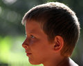
| 10/02/2007 07:52:32 AM |
02 - Danielby BudComment by Retroesque: I love the light in this image - I particularly like the way the backlighting shows the shape of his head - it's VERY appealing.
|
| Photographer found comment helpful. |
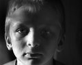
| 10/02/2007 12:57:16 AM |
01 - Calebby BudComment by ursula: He, he, first thing that came to mind, before reading your notes, is, "morning light!". The other thing that comes to mind is that the light is a bit too low, that is, I think I would try it with his head just a bit lower so that the light pattern would start closer to the hairline.
I think you got the "early morning look" quite nicely here, not only with the light, but also with his expression. |
| Photographer found comment helpful. |
| 10/01/2007 09:23:53 PM |
01 - Calebby BudComment by jdannels: I like the portrait and light, my only suggestion would be to make a reflector, some buy a 5 in 1 reflector, you can use a a piece of foamcore(thick posterboard) and cover it in aluminum foil. You can then use that as fill light. In this case you would put it on the left side of the frame to put a little light in the shadows and naturally brighten up his eye in shadow. just a suggestion :) |
| Photographer found comment helpful. |
| 10/01/2007 07:38:18 PM |
|
| Photographer found comment helpful. |
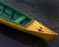
| 10/01/2007 02:47:24 PM |
Untitled #5by BudComment by KarenNfld: I love photos of boats and I love this photo. Great colours, great composition. |
| Photographer found comment helpful. |
| 10/01/2007 11:35:55 AM |
01 - Calebby BudComment by posthumous: Disturbing mood created with the light, and the expression matches it. That's a success, right? When everything contributes to the same feeling? It is in my book. |
| Photographer found comment helpful. |
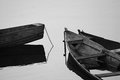
| 10/01/2007 11:00:32 AM |
30 - Canoesby BudComment by glad2badad: I really like the layout of this photo. The directional lines are exceptional and the contrast is perfect for BW. Nicely seen and captured! |
| Photographer found comment helpful. |
| 10/01/2007 10:29:12 AM |
01 - Calebby BudComment by lovethelight: i like the details of the shadows on the left, but I think you could have left the right side darker because it is getting noisy and unnatural the way you have it. just boost the contrast a bit and see how tat looks |
| Photographer found comment helpful. |
| 10/01/2007 10:21:23 AM |
01 - Calebby BudComment by shalrath: The shadows and highlights are well done here. However, I feel it is a little to evil and brooding to be used on the poor lad at that time of the morning! Perhaps on a more sinister subject this sort of light would work quite well. Note your comment from [user]Louis[/user], check his portfolio (namely his SPs) for usage of this sort of light. |
| Photographer found comment helpful. |
Home -
Challenges -
Community -
League -
Photos -
Cameras -
Lenses -
Learn -
Help -
Terms of Use -
Privacy -
Top ^
DPChallenge, and website content and design, Copyright © 2001-2026 Challenging Technologies, LLC.
All digital photo copyrights belong to the photographers and may not be used without permission.
Current Server Time: 07/22/2026 06:50:26 PM EDT.