| Author | Thread |
|
|
10/06/2007 12:32:54 AM |
|
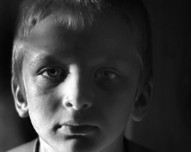
A very serious expression, but then it is early! ;) I'm with ursula, i'd like to see the pattern start on his hair. |
|
 Photographer found comment helpful. Photographer found comment helpful. |
|
|
10/04/2007 11:42:14 AM |
|
I like the light pattern adn the shadow of his eyelashes. I love how there is enough light in his eyes that I can see his irises. |
|
| Photographer found comment helpful. |
|
|
10/02/2007 12:57:16 AM |
He, he, first thing that came to mind, before reading your notes, is, "morning light!". The other thing that comes to mind is that the light is a bit too low, that is, I think I would try it with his head just a bit lower so that the light pattern would start closer to the hairline.
I think you got the "early morning look" quite nicely here, not only with the light, but also with his expression. |
|
| Photographer found comment helpful. |
|
|
10/01/2007 09:23:53 PM |
|
I like the portrait and light, my only suggestion would be to make a reflector, some buy a 5 in 1 reflector, you can use a a piece of foamcore(thick posterboard) and cover it in aluminum foil. You can then use that as fill light. In this case you would put it on the left side of the frame to put a little light in the shadows and naturally brighten up his eye in shadow. just a suggestion :) |
|
| Photographer found comment helpful. |
|
|
10/01/2007 11:35:55 AM |
|
Disturbing mood created with the light, and the expression matches it. That's a success, right? When everything contributes to the same feeling? It is in my book. |
|
| Photographer found comment helpful. |
|
|
10/01/2007 10:29:12 AM |
|
i like the details of the shadows on the left, but I think you could have left the right side darker because it is getting noisy and unnatural the way you have it. just boost the contrast a bit and see how tat looks |
|
| Photographer found comment helpful. |
|
|
10/01/2007 10:21:23 AM |
|
The shadows and highlights are well done here. However, I feel it is a little to evil and brooding to be used on the poor lad at that time of the morning! Perhaps on a more sinister subject this sort of light would work quite well. Note your comment from [user]Louis[/user], check his portfolio (namely his SPs) for usage of this sort of light. |
|
| Photographer found comment helpful. |
|
|
10/01/2007 09:52:10 AM |
|
I like the high contrast and black and white. I think you've used the window's natural light well to get that effect. Whereas this light shows the structure of his face well, I think the pattern of light on his face makes for a less well presented photo, particularly for a young subject. Unless the intent is to convey some less happy message, which might fit with the expression. |
|
| Photographer found comment helpful. |
|
|
10/01/2007 07:50:31 AM |
|
I love how the light seems to be reflecting on the left side of his face as if to give a little balance to the picture. |
|
| Photographer found comment helpful. |
Home -
Challenges -
Community -
League -
Photos -
Cameras -
Lenses -
Learn -
Help -
Terms of Use -
Privacy -
Top ^
DPChallenge, and website content and design, Copyright © 2001-2026 Challenging Technologies, LLC.
All digital photo copyrights belong to the photographers and may not be used without permission.
Current Server Time: 07/18/2026 02:33:40 AM EDT.