DPChallenge: A Digital Photography Contest You are not logged in. (log in or register
 
Browse Settings
Currently viewing:
Registered UserGinaRothfels

Show comments:

Per page:

Order:

Comments:


Comments Received by GinaRothfels
Pages:   ... [312] [313] [314] [315] [316] [317] [318] ... [538]
Showing 3141 - 3150 of ~5378
Image Comment
day 1 - separate lives
05/01/2007 09:26:17 PM
day 1 - separate lives
by GinaRothfels

Comment by KarenNfld:
Oh wow, great title for this! What a great moment you captured, striking in its contrasts.
Photographer found comment helpful.
day 1 - separate lives
05/01/2007 09:15:33 PM
day 1 - separate lives
by GinaRothfels

Comment by SandyP:
Gina!!! This photo TOTALLY rocks!!! It is MY kind of photo. It's amazing how you have managed the kindly lady to almost glow in the light, without making it look fake or weird. The richness of focus are just amazing! I am really looking forward to seeing more of your stuff if this is any indicator of your talent!

Photographer found comment helpful.
day 1 - separate lives
05/01/2007 09:00:47 PM
day 1 - separate lives
by GinaRothfels

Comment by walrus451:
I really like this....love how you can still see detail in the shadows...
Photographer found comment helpful.
day 1 - separate lives
05/01/2007 06:57:48 PM
day 1 - separate lives
by GinaRothfels

Comment by roz:
excellent photograph .. i love how the dark ppl are sitting in the dark part of the scene and the white lady is sitting in the brighter area .. i like how they dont seem to be aware of you taking their picture .. wot, are you invisible??!!! ... great candid shot and excellent composition .. very nicely balanced and even tho its very busy re all the different textures and shapes going on, i reckon it really works .... :)
Photographer found comment helpful.
day 1 - separate lives
05/01/2007 06:54:04 PM
day 1 - separate lives
by GinaRothfels

Comment by JunieMoon:
Nice candid. Would like to have just a bit more exposure on the left, but definitely catches your title beautifully.
Photographer found comment helpful.
day 1 - separate lives
05/01/2007 06:53:24 PM
day 1 - separate lives
by GinaRothfels

Comment by sevilduvarci:
a very nice slice of life in this shot. and your title is really enhancing the effect of this picture. very nice job.
Photographer found comment helpful.
day 1 - separate lives
05/01/2007 06:49:34 PM
day 1 - separate lives
by GinaRothfels

Comment by Techo:
A great find. The title sure does go great with this scene. Very nicely composed and wouldn't work as well in color for sure! What B/W is all about :)
Photographer found comment helpful.
YKK
04/18/2007 05:26:46 AM
YKK
by GinaRothfels

Comment by klstover:
5.0 isn't "hated".
YKK
04/17/2007 12:10:56 PM
YKK
by GinaRothfels

Comment by Haneck:
Well, I guess I agree with most of what Konador said below... it does look a little over-sharpened, but still, this is really cool! It's an everday object in a new and interesting perspective.
As for the crazy score...I can just as easily picture this in the 6.0 range or in the 5.0 range. I can NEVER figure out what the DPC voters are going to like! The only theory I can come up with is this: if I personally like a photo, it will score horribly. :)
Photographer found comment helpful.
YKK
04/08/2007 09:11:18 PM
YKK
by GinaRothfels

Comment by Konador:
Posted this in the forums but putting it here too for future reference :)

I'm not being horrible or anything, just saying why in my opinion it didn't score well. You asked :)

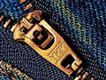
Firstly the subject isn't very interesting to me. I see zips every day. It's closer than I normally see one, but other than that there's nothing unique about it. There is no interesting lighting and just the one element in the whole frame. It also seems overly contrasty to me, and that makes the patterns in the denim hard to look at, it hurts my eyes after a while. Also, it's not sharp, it looks like you may have tried to sharpen it on the wrong radius which could explain the contrastyness too. The angle is flat on and the composition is centered, no interest really added there. To be very honest I would have scored it a 3 or 4. There's just nothing to it that makes me want to vote higher.

I think it probably did well on the smaller site because, just as was the case on DPC in the very early days, people not exposed to as much photography as we are here may see it and think "wow, that's really close!" or something, I dunno. Here, most people have probably taken the same shot,I know I have... "Hmm, I've got my macro lens on, now what?" I look down... "Ah ha!".

Also don't forget that it was in a free study. People expect much more in them and there was much much much higher competition than normal. That would also have something to do with it.

Sorry if I sound mean here, just trying to say it how I see it, rather than sugar coating it :)
Photographer found comment helpful.
Pages:   ... [312] [313] [314] [315] [316] [317] [318] ... [538]
Showing 3141 - 3150 of ~5378


Home - Challenges - Community - League - Photos - Cameras - Lenses - Learn - Help - Terms of Use - Privacy - Top ^
DPChallenge, and website content and design, Copyright © 2001-2026 Challenging Technologies, LLC.
All digital photo copyrights belong to the photographers and may not be used without permission.
Current Server Time: 05/08/2026 01:59:33 PM EDT.