| Image |
Comment |
| 08/09/2007 08:31:25 AM |
|
 Photographer found comment helpful. Photographer found comment helpful. |
| 08/08/2007 10:53:00 PM |
|
| Photographer found comment helpful. |
| 08/08/2007 08:39:51 PM |
|
| Photographer found comment helpful. |
| 08/08/2007 08:13:02 PM |
|
| Photographer found comment helpful. |
| 08/08/2007 10:57:01 AM |
|
| Photographer found comment helpful. |
| 08/08/2007 10:24:38 AM |
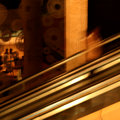
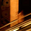
day 6 - going upby GinaRothfelsComment by Germaine: I think I'm coming in after the fact, but I like the strong, bright diagonals. They bring your eye to the woman who becomes a visual surprise. Very neat shot. |
| Photographer found comment helpful. |
| 08/08/2007 02:47:59 AM |
day 4 - light 2by GinaRothfelsComment by roz: yes i prefer this one more too .. beautiful rich colours and i like the arrangement of the lights .. :)
ps .. you said on my horse image that you drive unless you have no other choice, i prefer to drive too, but i think my 'obsession' for photography has overtaken my passion for driving !! :) |
| Photographer found comment helpful. |
| 08/07/2007 11:39:12 PM |
day 6 - going-up croppedby GinaRothfelsComment by bob350: Interesting. Removing the brighter stuff on the left in the original helps make this more dramatic to my eyes. Having the upright post appear a lot thicker this time catches me by surprise, and seems to reduce the sense of motion. I see that you are keeping a square crop, but I wonder why. Cropping the original to a vertical rectangle might keep the post looking thinner, and allow the gold diagonals to be longer, but at the price of giving up the square format. Still, I like both versions, each in its own way. |
| Photographer found comment helpful. |
| 08/07/2007 09:59:34 PM |
|
| Photographer found comment helpful. |
| 08/07/2007 09:59:07 PM |
day 4 - light 2by GinaRothfelsComment by Jutilda: For a weird reason, I like this one more. Had I not seen the other one, I wouldn't know what it is, but that's what makes it intriguing. |
| Photographer found comment helpful. |
Home -
Challenges -
Community -
League -
Photos -
Cameras -
Lenses -
Learn -
Help -
Terms of Use -
Privacy -
Top ^
DPChallenge, and website content and design, Copyright © 2001-2026 Challenging Technologies, LLC.
All digital photo copyrights belong to the photographers and may not be used without permission.
Current Server Time: 06/27/2026 04:27:42 AM EDT.