Arkitektby
sbeaumontComment by HBunch: *Critique Club*
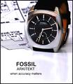
I'm going back and forth on weather or not I like the blueprints behind the watch. My first thought is that it draws attention away from the watch and makes the photo look a bit busy in the upper half.
My second thought is that it does make a nice creative meaningful background for the watch. I guess I'd have to see it without it to be able to make a final decision on that, but I think that you being the photographer probaby know which way it looked best.
Focus and clarity are really good. Nice detail in the watch and the DOF is really good on the blueprint.
The angle is really good, but wonder if the top should be cropped a bit higher to show the entire watch. The part of the watch band I CAN see is orange and if the watch band on this watch is all orange, I would not buy it. I'd want a watch that had an attractive band as well as face. So maybe seeing a little more of the watch band would be a good idea if you were trying to sell this watch.
Lighting is good. There are only a few reflections I can see. On the upper points on the watch face, there are 2 yellowish orange reflections. There is a dark reflection on the upper area of the watch face, and then the reflection from the blueprint on the left side of the face. Not sure how to avoid these, but they could have been lessened in post processing.
I like the text. It's to the point and grabs our attention to make us want to look at the pic more. I think it's a good choice and placement.
I also like the reflection of the watch in the surface it's sitting on. Not sure why, but I think it adds something to the bottom of the photo that would not be there if the reflection were not there. Just a little something that is not distracting, but enough to add interest.
Overall, a good shot, but might just need a bit of cleaning up and maybe a taller crop.
~Heather~