| Image |
Comment |
| 05/14/2004 04:28:07 PM |
|
| 05/12/2004 11:24:24 PM |
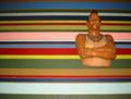
Stripes and Solidby elinenbeComment by wkoffel: Ha! Great idea. I love it. The execution is close, but the lighting is so harsh, it distracts from the great colors here, and the overall appeal, I fear. |
| 05/12/2004 11:05:11 PM |
Stripes and Solidby elinenbeComment by jano: Doesn't work for me - 2. The Mr. T figure just seems totally out of place, and the idea doesn't really fit the challenge. |
| 05/12/2004 07:30:29 PM |
|
| 05/12/2004 07:20:12 PM |
|
| 05/12/2004 01:41:10 PM |
Stripes and Solidby elinenbeComment by Neuferland: I guess it meets the challenge, barely. Nothing to really hold my attention, the lighting is off and the colors are more distracting than appealing. A 2 |
| 05/12/2004 01:23:42 AM |
|
| 05/11/2004 11:19:49 AM |
Manhattan Westside Docksby elinenbeComment by autool: Composition: Subject Placement, Cropping, Background 4
Technical: Focus, Exposure, Lighting, Processing 6
Appeal: Is it Interesting, Motivating, Etc.? 1
How well does it meet the challenge: 10
Total Averaged Rating 5.25 Dick
|
| 05/10/2004 11:04:20 PM |
Manhattan Westside Docksby elinenbeComment by alanbataar: The shot seems pretty over-exposed. There is too much light color, and even the darkest shadows aren't very dark, which wouldn't be so bad, but the mid-tones are also quite pale. A session with Levels in Photoshop will fix this. |
 Photographer found comment helpful. Photographer found comment helpful. |
| 05/10/2004 09:33:17 PM |
|
Home -
Challenges -
Community -
League -
Photos -
Cameras -
Lenses -
Learn -
Help -
Terms of Use -
Privacy -
Top ^
DPChallenge, and website content and design, Copyright © 2001-2026 Challenging Technologies, LLC.
All digital photo copyrights belong to the photographers and may not be used without permission.
Current Server Time: 07/15/2026 12:21:21 PM EDT.