| Author | Thread |
Comments Made During the Challenge  |
|
|
05/18/2004 02:03:12 PM |
|
funny and interesting. not opposite |
|
|
|
05/17/2004 01:11:16 PM |
|
|
|
05/16/2004 09:04:50 PM |
|
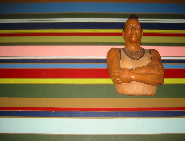
There seems to be some flash reflection off old Biff there, other then that i see no flaws, and find it a most outstanding photo. |
|
|
|
05/16/2004 09:40:10 AM |
|
Really cool photo but I'm not sure that I'm feeling it for the challenge. Good job none the less... |
|
|
|
05/16/2004 05:55:39 AM |
|
Kind of an odd photo in my eyes. I get the way you met the challenge theme however I find little or no interest in this photo. Sorry only a 4 from me. |
|
|
|
05/15/2004 12:22:19 PM |
|
This is just a weird shot, sorry. It looks ike you stuck that figure onto some striped paper and shot with flash (thus the hot spots on the figure's chin, forehead, etc). I don't get the statement you are making. |
|
|
|
05/15/2004 10:45:15 AM |
|
Effective - kinda "spacy" The several white spots on the striped part of the image are a bit distracting. |
|
|
|
05/15/2004 04:01:57 AM |
|
I don't get it - opposites? |
|
|
|
05/15/2004 01:12:42 AM |
|
very interesting. focus could be a little sharper. |
|
|
|
05/14/2004 05:18:54 PM |
|
Great colors and composition. The placement of the figure is a bit of an optical illusion because of the shadow. I don't get the sense of opposition since there's really nothing solid portrayed. Very inventive entry. |
|
|
|
05/14/2004 04:28:07 PM |
|
I get the theme, but the image isn't very acessible to me... |
|
|
|
05/12/2004 11:24:24 PM |
|
Ha! Great idea. I love it. The execution is close, but the lighting is so harsh, it distracts from the great colors here, and the overall appeal, I fear. |
|
|
|
05/12/2004 11:05:11 PM |
|
Doesn't work for me - 2. The Mr. T figure just seems totally out of place, and the idea doesn't really fit the challenge. |
|
|
|
05/12/2004 07:30:29 PM |
|
|
|
05/12/2004 07:20:12 PM |
?Opposites- doesn't really say that to me. Sorry.
|
|
|
|
05/12/2004 01:41:10 PM |
|
I guess it meets the challenge, barely. Nothing to really hold my attention, the lighting is off and the colors are more distracting than appealing. A 2 |
|
|
|
05/12/2004 01:23:42 AM |
|
Great concept. Love the colors. |
|
Home -
Challenges -
Community -
League -
Photos -
Cameras -
Lenses -
Learn -
Help -
Terms of Use -
Privacy -
Top ^
DPChallenge, and website content and design, Copyright © 2001-2026 Challenging Technologies, LLC.
All digital photo copyrights belong to the photographers and may not be used without permission.
Current Server Time: 06/28/2026 09:38:03 AM EDT.