| Image |
Comment |
| 11/08/2004 02:49:46 AM |
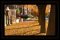
Novemberby dwterryComment by RedOak: Colours are very nice and rich. Also really enjoy the crop, although i think i would've prefered it without the tree on the far right. Also, I would recommend bringing the 'orange' frame line a lot closer to the picture. The separation, as much as being unbalanced (bigger black spacing inside then outside) creates a void between the picture itself and 'end' of the pic. See my 'October free Study' picture "Heaven-Seen-Through-Urban-Eyes" to better see/understand what i mean (I am in no way implying that my picture is better then yours). |
 Photographer found comment helpful. Photographer found comment helpful. |
| 11/08/2004 01:07:14 AM |
|
| Photographer found comment helpful. |
| 11/08/2004 12:44:43 AM |
Novemberby dwterryComment by AutumnCat: The photo looks lovely. Great color and sharpness. The frame seems to dwarf the photo - and is unfortunately distracting - it draws my eyes away from the photol. |
| Photographer found comment helpful. |
| 11/07/2004 09:51:16 PM |
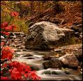
Autumn in the Rockiesby dwterryComment by kevinswope: I run into this same situation all of the time. You did an excellent job with the water blur but theres not much of an interesting surronding to the river. The rock and the trees in the background take away from the picture. The trick is to find and sit up where the whole image is interesting without the water blur then when you take the shot with the water blur it is excellent. Kevin |
| Photographer found comment helpful. |
| 11/07/2004 08:46:37 PM |
Autumn in the Rockiesby dwterryComment by Imagineer: Very pretty. Nice water (ND?), a bit busy but still very seasonal. I fany faults it's a bit short of depth in the subject, but good luck. |
| Photographer found comment helpful. |
| 11/07/2004 08:12:11 PM |
|
| Photographer found comment helpful. |
| 11/07/2004 02:22:11 PM |
|
| Photographer found comment helpful. |
| 11/07/2004 05:34:11 AM |
Autumn in the Rockiesby dwterryComment by Jeileen: Definitely one of my top picks in this challenge. Something I would hang on my wall. The color in the foreground adds significantly to this photo. Good job. 10 |
| Photographer found comment helpful. |
| 11/06/2004 02:00:00 PM |
Autumn in the Rockiesby dwterryComment by mfairbanks: Ok, I LOVE the color contrast between the red relaves in the forefront and the eart tones behind them, as well as the soft water, however, the rest of it looks a little soft on the focuse, particularly the underside of the one large boulder in the middle of the pic. and the smaller rocks to the left rear of it. As it is it's still a 6 in my book, if those components were sharper I would have probably rated it an 8. Still a wonderfull shot though!
Mike
|
| Photographer found comment helpful. |
| 11/06/2004 12:38:52 PM |
|
| Photographer found comment helpful. |
Home -
Challenges -
Community -
League -
Photos -
Cameras -
Lenses -
Learn -
Help -
Terms of Use -
Privacy -
Top ^
DPChallenge, and website content and design, Copyright © 2001-2026 Challenging Technologies, LLC.
All digital photo copyrights belong to the photographers and may not be used without permission.
Current Server Time: 07/16/2026 07:05:52 AM EDT.